A Civic Atlas of Homelessness Response & Human Pathways
When people struggle. How systems respond. How both shape the community we all share.
💻Works on your phone — built for a bigger screen. For the full experience, open on a computer.
The crossroads: THE SIDEWALK
The crisis lives on our sidewalks.
643
neighbors unsheltered tonight — up 45% from 443 two years ago
Human beings in visible crisis — untreated addiction and/or mental illness, in public, every day.
Our whole community struggles with the same question:
how can this be happening in Spokane?
The crossroads: THE OVERDOSE DEATHS
One of America’s highest overdose death ratesfor jurisdictions over 300,000 population.
The crossroads: DOWNTOWN
Downtown is struggling.
30–40%
storefront & office vacancy in the core
Assessed values sliding. Anchor tenants gone or wavering. Jobs being lost.
For the first time in decades, the community is wondering whether downtown Spokane remains viable.
Spokane stands at a crossroads, it’s time to decide which way to go.
To help make those decisions, we have maps. This website brings together different maps of the same crossroads — different ways of seeing one crisis — with the navigation to help our whole community find its way through.
This website is being built as a shared resource for everyone working towards an effective and compassionate response to the intertwined challenges of homelessness, untreated mental illness, and substance addiction.
A collaborative and regionalhomelessness response system is our future and our foundation for success.
Successfully moving forward from the crossroads on which we now stand demands it.
Moving forward with a collaborative and regional homelessness response system:A TRIP LONG OVERDUE
A trip to save lives and to restore our community —
And a destination that recognizes that our community — its neighborhoods, schools, businesses, and everything else that makes us “Spokane” — is only as strong as the care and support we provide to our most vulnerable neighbors.
Following are maps on the seat beside us —maps with the information needed to get us there.
SPOKANE CROSSROADS
One Civic Atlas. Five map views of the system.
1 · System Overview map
One simplified picture of the whole system: the path a person walks from the street to a home, the five stages along it, the programs at each stage, and where people fall off. Read this first; the detail comes in behind it.
2 · Continuum of Care map
The whole atlas
The region’s whole response system on one page — 70 programs across 10 stages and 5 lanes, the funding, the true costs, the history, and the hard questions. Every other map on this site fits inside this civic atlas.
3 · Safe & Healthy map
A live initiative, right now: 33 regional leaders spent a year writing 14 recommendations. This view places each one on the map: what it would touch, which gaps it reaches, and what it would take.
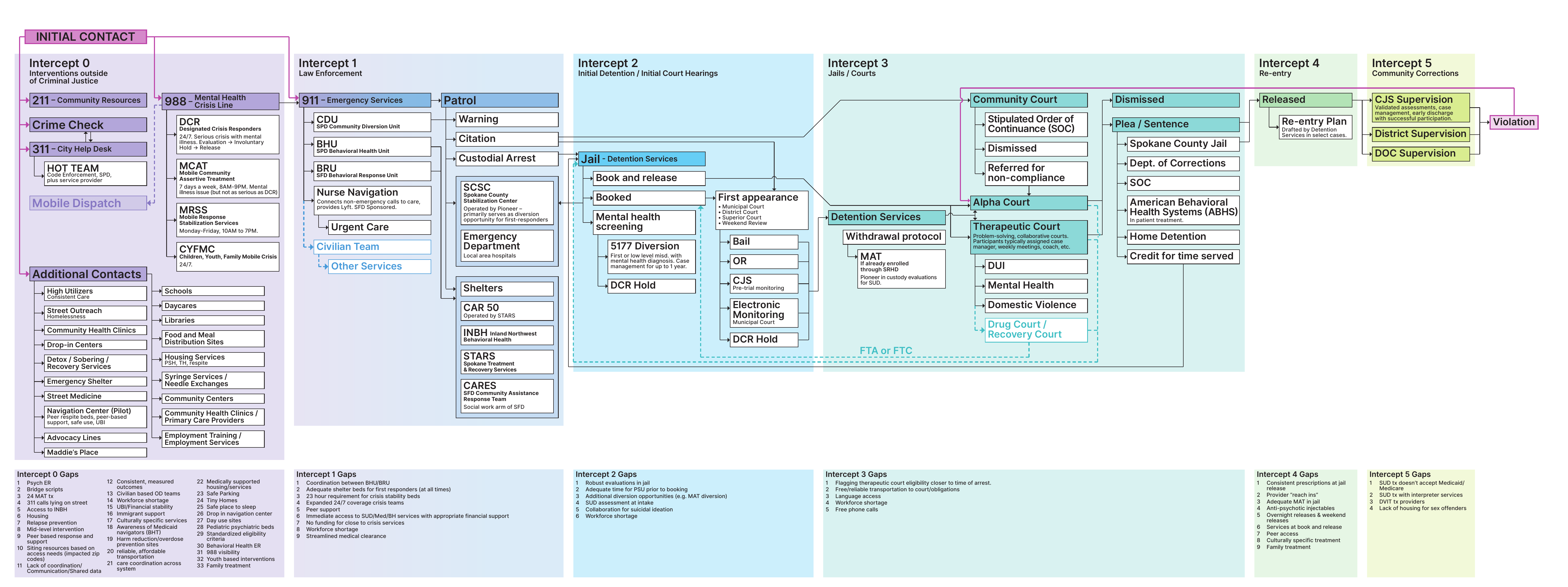
4 · Sequential Intercept map
One journey in close-up: how people cycle between crisis and the criminal-justice system — and the 66 documented gaps where that cycle could be interrupted.
5 · Faith Community Ecumenical map DRAFT
A shared inventory of faith-community services, resources and proposals across the same ten stages. Explore different approaches, their contributions and the details still to verify.
↑ Choose any of the five views to begin
Click anywhere or press Enter to continue · Esc to skip
Photograph by James Richman · used with permission
Continuum of Care Map DRAFT
A civic atlas of homelessness response and human pathways
When people struggle. How systems respond. How both shape the community we all share.
What do you want to do?Pick a lane. Every item says what it opens. Press Esc or click outside to close.
🧭
New here? Start with these
Five minutes that make the rest of the map make sense.
🆘
Helping someone right now
Plain-language guides for a family member, friend or coworker in the middle of it.
⚖
Understand what’s wrong, and what to do
The argument of the map: how Spokane got here and what would change it.
🗺
Explore the map
Change what the boxes show, or jump straight to a provider or a place.
💰
The money & the plan
What the region spends today, what the status quo costs, and what has been proposed.
✋
Take action
Your part, and the record behind it.
A working mom whose rent outran her paycheck. One eviction, three months on the street, six in shelter — then rehoused. The system’s most common story, and its most preventable.
A decade outside, cycling street ↔ jail on low-level charges — four bookings a year, no exit ever offered at release. The revolving door, itemized.
Three reversals before treatment finally stuck. The crisis phase cost as much as the entire recovery that followed — the case for same-day MAT at the first overdose.
Psychosis in public, a co-responder call, a 120-hour hold, a 14-day commitment, release to an LRA — and the fragile handoff to outpatient that decides everything after.
A woman the survival circuit kept alive — meals, naloxone, a familiar corner — but never connected to an exit. Her journey ends where 344 others did last year.
Autism never diagnosed in childhood (it happens all the time), then military service and PTSD, then co-occurring illness. He cannot survive the four-appointment path to a diagnosis — so he circles, undiagnosed, forever eligible for help he can’t reach.
His county has no detox, no MAT, no shelter. He came here because help exists here — the regional-hub story working as intended, at Spokane’s expense.
Drawn by an unenforced scene, not services. Enforcement changed the calculus; she moved on. The uncomfortable persona — included because honesty requires it.
Core views
Lens 4 · The Lutz Acuity Lens DRAFT
Funding / operating status
Fully funded / operatingPartially funded / under capacityGap — missing or critically short
Who leads each box?
City of SpokaneSpokane CountyState / FederalPrivate & FaithShared / Blended — the seams
LENS 4 · THE LUTZ ACUITY LENSpick a need, then a level of acuity · drag to move
🩺 The Lutz Acuity Lens — needs × acuity
For each human need, at each level of acuity: who provides, and where are the empty cells?
A clinician’s view of the same 70 programs. Needs run down the side in a Maslow-style order; acuity runs across from crisis (tonight) through acute (this week) and acute-on-chronic (a bad stretch in a long condition) to chronic / maintenance (for years). The region’s inflow sits in the top-left corner and its outflow in the bottom-right. Crisis response and harm reduction are different functions and sit in different columns. Every chip is a box on the Continuum of Care map; click it for the deep dive. ⚠ Draft tags, for reviewer comment. Designed by Dr. Bob Lutz, physician and former Spokane Regional Health District health officer, from his July 2026 review of this map. Press Esc or ✕ to return.
⛪ Faith Community Ecumenical map DRAFT
A collaborative view of services, resources and ideas contributed by faith-related organizations and communities.
The FBCS 2023 directory and proposals materially contributed to the initial inventory, alongside the atlas’s provider profiles and other references. Current provider and funder sources now supplement selected entries. Each entry retains its earlier source attribution and explains what was checked. No source or committee is treated as the voice of every faith community.
Rows describe kinds of contribution; columns use the same ten stages as the other maps. The cards distinguish service listings, resources, proposals and inventory opportunities. A listing can group several services, and organizations can recur across entries. These are not counts of unique providers or comparable capacity totals.
Access, participation requirements and service models differ. Clinical treatment, onsite partner care, peer support and referrals have distinct roles. Related links help readers explore the atlas; they do not establish a working referral agreement. Blank cells show gaps in this draft’s inventory, not confirmed gaps in the community.
DRAFT · content review September 16, 2026. Corrections and additional sources are welcome from providers, faith communities and people with lived experience. Current openings, complete coverage and a comparable regional bed total have not been verified. Press Esc to close an entry or return to the five maps.
📄 A Safe, Clean City — Faith-Based Committee of Spokane: Ecumenical Directory & Proposal to Civic and Community Leaders (2023)
2023 directory and proposal · 28 pages · Esc or ✕ returns to the faith map
Directory update · September 16, 2026: Shalom’s listed services stopped August 20; its former site is not an available service. Current status notice. The original historical document is unchanged.
FAITH COMMUNITY ECUMENICAL MAP (DRAFT):Highlighted boxes are related map categories. They do not establish uniform provider coverage or referral agreements.
SAFE & HEALTHY ROADMAP:
Safe & Healthy Spokane Task Force — June 2026 Roadmap
33-member regional task force (Sept 2025–Jun 2026) · convened by GSI, Downtown Spokane Partnership, Greater Spokane Valley Chamber, Avista & Waters Meet Foundation · final report June 11, 2026
Map-only view
Regional Asset Map — Spokane County service locations
How doors open: meal programs and day centers are walk-in; many shelter beds are assigned by referral through the Housing Navigation Center (527 S Cannon St) — when in doubt, start there or call 2-1-1.
⚠ Locations geocoded July 2026 — approximate in a few flagged cases; verify before publication. Click any pin for capacity, operator, funding, and hours.
About Spokane Crossroads
A Civic Atlas of Homelessness Response & Human Pathways Developed by Gavin Cooley · August 2026 · draft for review
Why this atlas
How to navigate
Sources & methods
Glossary
About & corrections
Spokane Falls and the Monroe Street Bridge · photograph by James Richman, used with permission
WHY SHOULD I CARE ABOUT ANY OF THIS?
Because everything you want from Spokane — safe streets, good jobs, an affordable place to live, taxes that build things instead of bandaging them, a downtown to be proud of, and neighbors who get help instead of dying outside — sits on the other side of solving this one problem well.
A community that stops paying for damage control and triage can finally afford to be the community everyone is looking for. That’s this whole map in one sentence — the humanity and the hometown, together.
Let it be said plainly: homelessness — sheltered and unsheltered — addiction, and untreated mental illness are the defining issues of our time in Spokane. They are not one civic problem among many. They are the ground on which every one of our highest aspirations — a thriving downtown, safe neighborhoods, a city our children choose to stay in — will either stand or fall. Only once before has this city faced a challenge of comparable size: the long transition from a resource-based economy to the broader one we live in now. Many towns of that era never made the turn — they are names on old maps. Spokane is still here, because an earlier generation did the hard thing. This is that moment again — a live-or-die moment for Spokane. That is why this civic atlas exists.
“The true measure of any society can be found in how it treats its most vulnerable members.”
— long attributed to Mahatma Gandhi, and repeated because it keeps being true
“The test of a civilization is the way that it cares for its helpless members.”
— Pearl S. Buck, My Several Worlds, 1954
Start here: why any of this should matter to you
Most people in Spokane don’t want a systems map. They want something much simpler: a clean, safe community where they can raise a family, walk downtown, build a business, and afford to grow old feeling satisfied with their community and the life they’ve lived there — the ordinary but essential promise of a successful American city. The health and safety crisis on our streets has carried Spokane a long way from that promise, and every resident feels it: in the doorways they steer their kids around, in the businesses that gave up, in the neighbors and family members lost to fentanyl, in the quiet sense that nobody is in charge of fixing it.
What follows is, frankly, the sausage-making — dozens of programs, agencies, funding streams, and legal machinery, laid out in detail. That detail matters for one reason only: you cannot navigate out of a maze you refuse to look at. But don’t mistake the map for the destination. The real purpose of this entire document is to chart the pathway back to the thing citizens actually care about — a safe, healthy, humane community — and to show that the way back is not mysterious, not hopeless, and not beyond a region of our size and strength. Everything below serves that single end.
Why this atlas exists: you can’t fix what you don’t understand
Spokane County has the one of the highest overdose death rates in America among jurisdictions over 300,000 people — second for the 12 months ending September 2025, and sixth on CDC’s newest file (12 months ending December 2025) at 51.6 per 100,000, as our own count fell from 322 to 287 (download the underlying data — the full CDC workbook, methodology and rankings). That statistic leads this page not because it is the whole problem, but because it is the most visible and most tragic manifestation of the deeper one: a response system whose parts cannot see each other. Treat that dated number as this project’s anchor point. The figure will change — Spokane’s standing will improve or worsen with every CDC release, and the source workbooks linked throughout this map will always show the latest. But the September 2025 ranking is fixed in time deliberately: it records where this community stood when this map was created, and why the call to action was issued. If you are reading this years from now and the number has fallen, the anchor marks how far we came; if it has not, it marks how long we knew. It’s the old parable of the blind men and the elephant — one holds the tail, one the trunk, one an ear, and each describes a different animal. Spokane’s public debate works the same way: one group sees only shelters, another only enforcement, another only treatment — and policies built from one piece of the elephant keep failing. This map is the whole elephant, drawn so that officials, providers, funders, and citizens can finally argue from the same picture. Because the system’s worst failures happen at the seams — between jurisdictions, and between services — and you cannot mend a seam you cannot see.
Yes, this map is complicated. It has to be.
The first reaction almost everyone has to this map is: this is overwhelming. That reaction is correct — and it is the point. The map is complicated because the system is complicated: ten stages, five parallel lanes, seventy-plus programs, four governments, dozens of providers, and a hundred-plus funding streams that no single person in Spokane has ever been able to see in one place. A simple picture of this system would be a false picture — and Spokane has been making decisions from simple pictures for years. Anyone who hands you a one-sentence answer to homelessness — "just build shelters," "just enforce the law," "just fund treatment" — is describing one box on a board that has seventy.
Here’s the payoff for embracing the complexity: the crisis doesn’t live inside the boxes — it lives in the seams between them. People don’t die because a detox bed or a shelter cot doesn’t exist; they die in the handoff — released from jail with no warm connection to treatment, discharged from the ER to the sidewalk, stabilized at the crisis center and returned to the camp. And notice what catches everyone the seams drop: police, emergency rooms, and jail — the three most expensive, least effective, least humane responses a society owns, running as our de facto front line and billed to the public at crisis prices — roughly $170 per resident per year in damage control alone (see The Bill). Nobody gets to opt out of paying; the only choice is what the money buys. You literally cannot see a seam unless both boxes are on the same page. That’s why this map refuses to simplify. Give it fifteen minutes of honest attention and the complexity resolves into something better than simple: clear. And clarity about a complicated system is the one thing Spokane has never had.
Spokane didn’t invent this — fragmentation is the American default
Step back one level and the pattern sharpens. America runs its homelessness response the way it runs its healthcare: hundreds of disconnected payers, programs, and providers — each one rational alone, irrational together. The healthcare version is famous: the U.S. spends more per person than any wealthy nation (roughly $14,500 a year) and ranks last among peer countries in outcomes — because fragmented systems pay for the same problem many times and prevent it never. The homelessness version is this map: competing municipal budgets, rigid categorical grants, providers who can’t see each other’s data, and no one accountable for the whole person. Fragmentation is expensive everywhere it appears, and for the same reason: every seam gets billed to the public at emergency prices.
Be honest about the trade-off, because it explains the resistance. Unification costs its members something real: autonomy. Every silo gives up the right to do things "their own way" — its own intake form, its own board priorities, its own definition of success. That is not a small ask, and it is exactly why collaborative recommendations keep being praised and then shelved. But the actual choice on the table is not autonomy versus unity in the abstract. It is institutions keeping their own way, versus citizens getting outcomes. Every community that has bent this curve made the same trade.
And here is the part that matters most: none of those national flaws take Spokane’s destiny out of Spokane’s hands. We do not get to redesign American healthcare or federal grant law from here — but we don’t need to. Communities that hyper-collaborate inside the same flawed national system — one governance table, shared data, outcomes dated and measured — routinely wring good results out of bad architecture. Houston did. Boise did. Nothing they used is unavailable to us. The constraints are real; the excuse is not. Spokane can be the example of how a region works beyond these constraints — not a victim of them.
Who this map is for — maybe you
We built this as a civic tool — but somewhere along the way it became something else too: a map for people who are actually lost in this system right now. Maybe that’s you. Maybe you’re a parent lying awake because your son is using and you don’t know whether detox, treatment, or the crisis line comes first — or what an ITA even is. Maybe you’re trying to claw your own way back and nobody has ever shown you how the doors connect. Maybe your sister was just released from jail with nowhere to go, or your father is declining and you’ve just learned words like "guardianship" and "adult family home." Or maybe you’re none of these — just a citizen who wants to understand, or someone with a free Saturday and a feeling that you ought to be useful somewhere.
This map serves all of you, and it was built so no one needs a degree in public administration to use it. If you need help now: call or text 988 for crisis, dial 2-1-1 for everything else, and know that every pin on the 🗺 Regional Asset Map is a real door with a real address — shelters, detox, clinics, meal programs, all of it. If you’re navigating for someone you love, follow the lane that matches their situation left to right — the boxes will show you what exists, what it costs, and what typically comes next; the 🔍 search finds any program or term in seconds, and the glossary translates the system’s language into English. If you want to help, open 🤝 "What can YOU do?" in the Other menu and pick your door. Yes, this map is complex — the last section explained why it has to be. But complexity that’s been organized is no longer a maze; it’s a map. Give it fifteen minutes. Whatever brought you here, you’ll leave knowing more about where you — or someone you love — stands, and what door to try next.
The holy grail: collaboration, integration, regionalization
Every feature of this map ultimately points at one conclusion, so it should be stated plainly at the top: the answer to Spokane’s crisis is not primarily more money, more buildings, or more programs — it is making the parts we already have work together. That is not a hometown theory; it is the consistent testimony of the leaders of the American cities that actually turned their crises around. Houston’s three-term Mayor Annise Parker, whose region cut homelessness by nearly two-thirds, says the only thing Houston did differently was find a way to work across jurisdictional and political lines — a blue city and red counties, one system, one database, rowing together. Dave Bieter, Boise’s four-term mayor — whom the Spokane Business Association brought to Spokane as its keynote speaker last year — tells the same story from a city Spokane’s size: Boise’s results came from a by-name, university-refereed, genuinely regional partnership, not from outspending anyone. Collaboration, integration, and regionalization are the holy grail of this work. Everything else on this map — the gaps, the loops, the receipts — is what their absence looks like.
What collaboration actually asks of us
The politics of this moment pull everything toward the binary — left or right, right or wrong, my approach or yours. Collaboration is the deliberate breaking of that habit, and a city like Spokane is exactly the place it can be done. We are not Washington, D.C.; we are a community with a long record of coming together — across parties, neighborhoods, and faiths — to solve hard problems, and of genuinely caring for one another while we do it. That civic muscle is the real asset under everything on this map.
But collaboration also means retiring some lines we’ve drawn inside the response system itself. The Housing First versus services-first fight now playing out in the federal NOFO is the loudest example — and as this map shows throughout, the honest answer has always been both, in combination. The same is true across every other divide we’re tempted to treat as a contest: nonprofit, for-profit, and faith-based providers; low-, medium-, and high-barrier services — each one serves people the others cannot reach, and all of them contribute to the whole. The faith-based programs deserve particular mention: they are an essential part of this community’s fabric, and while they will always — and should always — maintain their independence, they can be full partners in the planning and execution of a well-run system. None of that happens without the unglamorous thing underneath it all: constant communication. No box on this map has the right answers alone. The system does — but only when it talks to itself.
Spokane has known this for years — a short institutional memory
This is not a new discovery for our region; it is a repeatedly rediscovered one, and this project stands in a specific lineage. Its author served as the City of Spokane’s Chief Financial Officer for seventeen years, and many of the lessons in this map were learned inside City Hall during the Condon administration (2012–2020), working alongside City Administrator Theresa Sanders and Rick Romero — who championed collaboration and integration across city government for years before it was fashionable, proving on utilities, budgets, and capital projects that Spokane’s jurisdictions could act as one when leadership insisted on it.
In 2023, Cooley, Sanders, and Romero carried that conviction into the homelessness arena — entirely as volunteers, unpaid and unaffiliated — spending roughly eighteen months building the Spokane Regional Collaborative — a formal effort, joined by the region’s elected leadership, to regionalize, integrate, and coordinate the homelessness response. Its record is public at spokaneunite.com, and its six workstreams read like a prophecy: legal structure for a regional entity, shared funding, shared data, governance, staffing, and how success would be measured — explicitly modeled on Houston. Set that agenda beside the Safe & Healthy Task Force’s 2026 roadmap (this map’s Safe & Healthy menu) and the overlap is unmistakable: an independent regional accountability council, a shared data system, formalized cross-system coordination, unified investment. The same recommendations keep resurfacing, through different authors and different years, because they are correct — and each time the region has stopped short of adopting them, the crisis has compounded. This map exists partly so that the next time, the whole community can see what is being proposed, and what declining it costs.
The crossroads, now: one regional measure — or three fragments
A dated snapshot, written in early July 2026 while these decisions were live. If you are reading this later, the specifics may have resolved — the pattern they illustrate never has.
That “next time” is not hypothetical. It is right now. The Safe & Healthy Task Force did a marvelous thing: thirty-three leaders across business, government, courts, law enforcement, providers, philanthropy, and lived experience spent a year building one shared roadmap — precisely the cross-constituency convening this region has repeatedly failed to sustain. The recommendations are on the table. The region’s leadership now faces exactly the decision the Regional Collaborative posed in 2023: adopt them together, or fragment again.
The early signals are worrying, in two directions at once:
Fragment one — a city going it alone. City leadership has signaled interest in pursuing the task force’s goals separately, through a city-only one-tenth sales tax. The argument offered is that separate funding streams can still be integrated and collaborative. They cannot — because integration and collaboration follow the money. Whoever levies the tax appoints the board, writes the contracts, sets the priorities, and answers to its own electorate; a separately funded city program will drift toward city-only purposes as surely as water runs downhill. This is not speculation — it is the operating history this whole page documents. And the arithmetic makes going alone doubly costly: under state law the public-safety sales-tax stack is finite (a best reading of roughly 0.50% maximum inside the cities), the councilmanic window under RCW 82.14.345 closes June 30, 2028, and every tenth claimed unilaterally shrinks and complicates what remains for a unified regional measure. If the city takes its tenth alone, the realistic prospect of mobilizing a full two-tenths behind the Safe & Healthy roadmap likely dies with it — and with it, the integrated facilities-plus-treatment ecosystem the roadmap says must be funded as one package or not at all. (The full capacity analysis is in the Other menu: Public Safety Tax Capacity memo.)
The region has already run this experiment. In November 2023, a 0.2% jail-centered measure went to voters without a unified regional plan behind it — and won barely more than a third of the vote. The Safe & Healthy Task Force was convened, in large part, to repair exactly that failure of collaboration and clarity of mission. To respond to its roadmap by fragmenting the funding again would be to reproduce, step for step, the mistake the task force was created to correct.
Fragment two — an agency crowding the till. In August 2026 the Spokane Transit Authority asked voters to approve what it labeled a “renewal” of its 0.2% sales tax — in substance a new twenty-year, roughly billion-dollar tax running to 2048, atop STA’s permanent 0.6%. It passed: Spokane County certified the result the week of Aug 17, 2026, with more than 51% in favor, and the tax now runs to 2048 at roughly $30M a year. An SBA analysis of STA’s own filings with the State Auditor found the expiring “temporary” tax was not needed to deliver its promised projects: between 2017 and 2024 the tax collected $169 million while STA’s reserves grew by $234 million — and over nine years STA’s actual results beat its own forecasts by roughly $320 million. Core transit service is not at risk either way. The relevance here is regional capacity: GSI’s Pulse surveys show the same public that ranks the health-and-safety crisis as its number-one concern is also acutely sensitive to affordability and total tax burden. A community will not absorb a billion-dollar transit tax in August and then layer additional tenths for Safe & Healthy behind it. If this region is serious about its own stated first priority, STA should stand down and let the Safe & Healthy measure go first.
The pattern in both fragments is the same one this page keeps naming: institutions optimizing their own silo at the expense of the region’s one shot at an integrated response. The task force built the plan. The capacity exists — barely, and only if it is husbanded. What remains is the leadership decision this map was built to inform: one region, one measure, one system — or another decade of well-funded fragments.
The myth of the uniquely doomed city
A quiet fatalism runs through Spokane’s leadership conversation — a sense that this crisis somehow landed on Spokane randomly, or because of geography, or some local peculiarity that makes the problem uniquely unsolvable here. The evidence on this map says otherwise, and the honest version is simpler and harder: Spokane’s crisis is not unique, and neither is its cure. What has failed here is not the city’s luck; it is our collective leadership’s ability to get out of its silos and leverage the region’s considerable resources — roughly $120–150 million a year, hundreds of providers, deep civic and faith capacity — against a very human and tragic problem. Boise is not richer than Spokane. Houston’s counties are not friendlier than ours. They simply decided to work as one system, and kept deciding it, election after election. Spokane’s citizens appear to understand this instinctively: Greater Spokane Incorporated’s Pulse surveys have consistently shown that the public’s number-one concern is the public health and safety crisis — the public is not confused about the priority; the system is. Closing that gap between what citizens want and what fragmented institutions deliver is precisely the work this map is built to serve.
The two pillars: why the map begins and ends where it does
Look at the map and you’ll see that its first and last columns are drawn differently — dark, numbered 1 and 10, each holding a single box. That is deliberate. They are not stages of the journey; they are the pillars the whole journey hangs between, and they come straight from the testimony of the mayors who succeeded.
Pillar one — enforced community standards — is the environment, not a program. Dave Bieter, Boise’s four-term mayor, calls its effect the One-Third Rule: when a city consistently and humanely enforces its public rights-of-way, roughly a third of the people on its streets go home to family — a bumpy road to recovery, but all roads out of addiction are bumpy; a third engage the services — the eight columns of machinery this map documents, sometimes by way of a criminal justice system properly built to be part of recovery; and a third, not yet ready, move on. Annise Parker says the same of Houston in fewer words. The insight both press is the one Spokane keeps missing: a region can work its service system harder and harder forever, but without a steady, humane “no” to the street itself, the system has no intake pressure — the people it was built for stay in place, the beds sit under-used, and the dying continues one column to the left of every program meant to prevent it. Enforcement without services is cruelty; services without enforcement is theater. The first pillar is what makes everything between the pillars actually run.
Pillar ten — the clean, safe, healthy community — is the point, not a slogan. It is the same promise this page opened with: a place to raise a family, walk downtown, build a business, and grow old satisfied. Putting it on the map as a numbered destination does two things. It keeps the sausage-making honest — every box in between must justify itself as a step toward column 10 or explain why it exists. And it makes success measurable rather than rhetorical: street counts falling, overdose deaths falling, downtown refilling, and the citizens’ #1 Pulse-survey concern receding. When those gauges move, column 10 stops being an aspiration and becomes a description.
Between the pillars sits everything else — and that is the discipline this map imposes on our debate: no more arguing about single boxes as if they were the whole building. Enforcement people must answer for what happens after the “no”; services people must answer for what happens without it; and every proposal, program, and tax measure should be asked the same two questions: does it strengthen pillar one, and does it move us toward pillar ten?
The full evidence file for the pillars — the cities that enforced with an offer, the cities that didn’t, and what a decade of both experiments produced — lives one click away: ⚖ The Case for the Pillars — two experiments, one choice.
What this is — and why it's shaped this way
An interactive map of Spokane County's entire homelessness, behavioral health, and criminal justice response system — every service, decision point, and pathway. It reads left to right as a human journey: the far left shows how people arrive and fall in, the far right shows where they land. That shape is deliberate. Systems are usually described agency by agency — which is exactly the silo view this project exists to break. Describing the system the way a person experiences it forces every agency, funder, and program onto the same page, whether they normally talk to each other or not.
The 10 columns are the stages of that journey — anchored by two pillars: column 1, The First Pillar (the enforced community standards the whole system rests on), and column 10, The Second Pillar (the clean, safe, healthy community it all exists to restore). Neither carries a number, because neither is a step a person moves through — the numbered stages run 2 through 9, between the pillars. The stages between them — including a Regional Inflow stage (because "where are they from?" deserves data, not myths), a robust look at daily Life on the Streets (because you cannot design exits from a life you've never examined), and a Fatal Overdose box (because that is what failure actually costs). The 6 numbered rows are the systems people move through — crisis response, housing, behavioral health, criminal justice, community/faith supports, and regional outflow. Click any column or row caption to drop a yellow highlight for walk-throughs; the numbers exist so a room full of people can find the same box at the same moment. The design bet of the whole project: if everyone can finally see the same elephant, the conversation changes.
Every button answers a question people actually ask
Each control at the top of this map exists because Spokane's public debate keeps circling the same questions. The map's job is to answer them with evidence instead of anecdote:
"Follow a journey" — Who are these people, really? Systems are abstractions; people aren't. Seven composite journeys — Maria (evicted), Dave (jail cycle), Alex (overdose survivor), Sam (involuntary treatment), Tanya (staying on the street), Marcus (came for treatment), Jenna (came for the scene) — each light up a real path through the boxes, including the dashed-red loops backward where the system leaks. Each journey carries a cost bubble and an itemized Receipt with full methodology, because the sharpest pattern in this whole map is fiscal: we spend crisis money forever and exit money never. Dave's cycle phase is a subscription; his exit phase is an investment. The receipts make that arithmetic impossible to unsee.
"Funding/Operating" — Where is the system actually broken? Every service box carries a stripe: green (fully funded/operating), amber (partial/under capacity), red (gap), gray (a pathway or outcome, not a service). Click Gap and the map becomes a to-do list — zero secure-withdrawal beds, missing medical respite, thin LRA supervision — visible in one glance. You fund what you can see; gaps stay unfunded precisely because they're invisible.
"Who leads?" — Who do we hold accountable for each piece? Every box is tagged with its steward. City of Spokane: the HUD Continuum of Care collaborative applicant — federal homelessness dollars, shelter contracts, coordinated entry, outreach. Spokane County: the regional behavioral health authority (SCRBH BH-ASO — the crisis system and involuntary-treatment gatekeeping), the jail, therapeutic courts, the 0.1% behavioral health tax, the opioid settlement, and co-governance of the Regional Health District. State/Federal: Medicaid — the single biggest payer on this map — plus Eastern State Hospital, DOC, and the Housing Authority's vouchers. Private & Faith: UGM, the meal circuit, the hospitals, most treatment and PSH operators — capacity that answers to donors and boards, not voters. And Shared/Blended marks the seams where two or more must act together. Click Shared and you are looking at exactly where the city-county silo failure does its damage. This menu exists because accountability is impossible when nobody knows who owns what — and because "the city should fix it" is wrong about half of this map, and "the county should fix it" is wrong about the other half.
"Key Providers" — Who actually does the work? Government funds this system, but nonprofits and congregations mostly deliver it. Click any of the 14 major providers to light their footprint — Catholic Charities across eight boxes, Frontier Behavioral Health across nine, UGM's entirely donor-funded four — and use the 🗺 button to see their physical locations. This menu exists to show two things at once: how much of the system depends on a handful of organizations, and how much capacity (UGM, the meal circuit, Dignified Workday's 500-person waitlist) never appears in any government plan.
"Safe & Healthy Task Force" — Is there actually a plan? Yes — 33 regional leaders spent a year producing one (June 2026), and this menu holds it: the 14 recommendations, the investment framework, the governance model, and every report. Its centerpiece is the Before/After view: BEFORE tints every public box by who runs it today — a five-color patchwork of separate command structures; AFTER shows the same boxes unified under the proposed Regional Accountability & Coordination Council. Two clicks, and the regionalization argument makes itself. This feature exists because the region is at a fork right now — one integrated plan, or competing city and county tax measures — and people deserve to see the difference before choosing.
"💰 Funding Map" — Follow the money. Every stream — federal, state, local, private — in tables with subtotals and an order-of-magnitude grand total (≈$120–150M/yr). It exists because no complete all-funds accounting of this system has ever been published — a missing ledger that is itself one of this project's central findings. You cannot manage $150 million a year that nobody can see in one place.
"🗺 Regional Asset Map" — Where is everything? All 100+ mapped locations, filterable by category or provider, hover any dot for details — plus a live layer of every licensed adult family home in the county — 600+ — pulled straight from state data. Geography is an argument: the downtown concentration of services, the near-emptiness of the Valley, and a court-supervised residential network bigger than the whole shelter system hiding in plain sight — none of that is visible in a spreadsheet.
🗖 Map-only view strips this header away for presentations — because this tool is meant to be shown to rooms of people, not just read alone.
What we hope you do with it
If you're a resident, use it to replace whatever slice of the elephant you've been holding with the whole animal. If you're an elected official or funder, click Gap, click Shared, run a receipt, and open the Funding Map — the agenda writes itself. If you're a provider or person with lived experience, tell us what we got wrong; every correction makes the shared picture stronger. The goal was stated at the top and it bears repeating: you can’t fix what you don’t understand — and the fix, once understood, is collaboration, integration, and regionalization. Once enough people see this system whole, working together stops being a plea and becomes the obvious move — as it was for Houston, as it was for Boise, as the Spokane Regional Collaborative proposed, and as the Safe & Healthy roadmap proposes again now. That’s how Spokane gets off the worst-in-the-nation overdose lists: not with one hero program, but with one system, seen clearly, run together.
Working the boxes
Hover any box for a plain-language description; the popup's gold link jumps straight to the full analysis. Boxes marked ▸ carry the complete treatment: Background & data (context, laws, and Spokane trend charts), Capacity & providers (who does what, with a location map), SWOT & path forward (what's working, what isn't, and best practices from cities that solved it), Funding (in tables, with totals), and Sources (every claim linked). Why SWOTs? Because an education tool that only describes the present teaches helplessness; each box also has to point at the way forward.
Reading the lines
The board opens clean — no lines. With seventy boxes, drawing every connection at once produces a web nobody can read. So the map waits: click any box and its connections light up — green arrows in show where people arrive from, blue arrows out show where they go next. Every lit line carries a small gold dot — click it and the line explains itself: why the connection exists, and what that handoff looks like in real life. The dashed red loops have dots too — theirs explain where the system leaks. Click a journey and only that route draws. Escape clears the board again.
Gray solid line — a forward pathway: how a person moves from one service or decision point to the next. Dashed red line — a loop backward: relapse, a shelter exit back to the street, re-arrest, or a psychiatric hold discharged to nowhere. The loops are where the system leaks. Thick blue line — the highlighted route while following one of the journeys (Maria, Dave, etc.); everything off that route fades. Yellow band — a clicked stage column or category row, highlighted for walk-throughs.
Quick reference
Hover a box → plain-language description; its gold link jumps to the full analysis. Click a box → summary panel with capacity, funding, and lead-agency badges. Hover a map dot → its details pop instantly; sweep across dots to browse. Click a stage number (top) or category number (left) → yellow highlight band; click both for an intersection. Journey menu → path lights up + cost bubble (click it for the itemized Receipt). Funding/Operating menu → light up all Fully / Partially / Gap boxes. Who leads? menu → light up City / County / State / Private / Shared slices, with an explainer bubble. Key Providers menu → a provider's footprint across the regional response system; the 🗺 button shows their locations. Safe & Healthy menu → the Roadmap, and the BEFORE/AFTER regionalization toggle. Escape backs you out of anything, one layer at a time: dot card → bubbles → menus → overlays → map-only view. 🗖 Map-only for presenting; zoom with − / +.
Where the information comes from
Every number on this map traces to a source you can check. Charts name their source in the subtitle; every deep-dive box ends with a Sources tab of links; and the project keeps a running audit log. The main source families:
Federal data: HUD Point-in-Time counts, Housing Inventory Counts, and CoC award records for Spokane (WA-502); CDC provisional overdose data (VSRR county files — the basis of the live overdose dashboard and Spokane's #2 national ranking).
Washington State: DSHS/ALTSA licensing data — including the live adult-family-home layer, pulled nightly from the state's own feature service; the Health Care Authority (Ricky's Law reports, Medicaid rates); Commerce (homeless grants, Right-of-Way funds); the Administrative Office of the Courts (therapeutic-court funding, guardianship); and the RCWs themselves for every legal claim (71.05 involuntary treatment, 11.130 guardianship, 70.128 adult family homes).
County & city: Spokane County Medical Examiner annual reports (overdose deaths by year); the county jail capacity dashboard; city CHHS releases, the Longitudinal Systems Analysis, budgets, and contract records; the EWU/Whitworth/WSU "Broader Context" PIT report.
Task force & commissioned studies: all Safe & Healthy Spokane publications including the Leifman Group assessment and the June 2026 final report; the Marbut Consulting survey (July 2025, for the Spokane Business Association) and the Discovery Institute's parallel Seattle study — presented side-by-side with the PIT on the where-are-they-from question, without declaring a winner.
Primary project research: Gavin Cooley's NOFO impact memos (provider-by-provider funding analysis), the CDC overdose analysis file, and direct mayoral testimony (Boise, Portland, Houston). News record: The Spokesman-Review, Inlander, Range Media, KHQ, KXLY, Center Square, The Columbian, and InvestigateWest, cited article-by-article. National models: Miami-Dade's Criminal Mental Health Project, Houston's The Way Home, Rhode Island's jail MAT program, Tucson's Crisis Response Center, and Built for Zero.
Cost methodology: the journey Receipts use unit costs derived from Spokane's own contracts wherever possible ($53/shelter-night from scattered-site contracts, $75/night from Catalyst's budget, $25K/PSH-year from CCEW's portfolio) and mid-range state/national figures elsewhere — every assumption is listed inside each Receipt.
Data honesty
⚠ marks figures still to verify; "[Audited Jul 2026]" marks verified entries. Where data doesn't exist (DCR volumes, discharge-to-street counts), the map says so — the measurement gap is treated as a finding. Where credible sources disagree (see "Where Are They From? It Depends on the Question"), both are shown without declaring a winner. All financial AND capacity figures (beds, units, dollars) are presented in tables with subtotals and totals wherever providers are enumerated. This is a living draft for review, not a final publication.
The language of this system, translated
Dotted-underlined terms anywhere on the map link here. Click one and you'll land on its definition.
5177 diversion — Washington’s misdemeanor mental-health diversion (from SB 5177): first or low-level misdemeanor + a documented MH diagnosis = case management up to one year instead of prosecution. Powerful, and paperwork-gated — the diagnosis requirement excludes exactly the undiagnosed (see Randy). ABD — Aged, Blind or Disabled program — The state’s small cash grant for adults awaiting federal disability decisions. The state recoups it from SSI back pay — the bridge literally funds itself. ABLE account — A tax-advantaged savings account letting a disabled person hold assets above SSI’s $2,000 limit without losing benefits. With special-needs trusts, the reason never to leave an inheritance to a disabled person outright. ACEs — Adverse Childhood Experiences — The landmark CDC/Kaiser framework scoring childhood trauma (abuse, neglect, household dysfunction, 0–10). High ACE scores predict addiction, mental illness, and homelessness decades later — the reason prevention economics start in childhood. AFH — Adult Family Home: state-licensed home for up to 6–8 adults with disabilities. ALJ — Administrative Law Judge — The hearing level of Social Security appeals, where a majority of represented claimants ultimately win — typically 1–2 years after the initial denial. Representation costs nothing up front (fees capped, paid from back-benefits). Apple Health — Washington’s Medicaid program, run by the state Health Care Authority. Free coverage for adults 19–64 with income up to 138% of the poverty line (about $1,835 a month for one person in 2026), plus children, pregnant people, and the aged/blind/disabled “Classic” programs. The payer behind nearly every treatment door on this map. The 🆘 HELP primer “Medicaid: get the card, keep the card, use the card” walks through it. Apple Health navigator — A trained, free enrollment helper — in Spokane, the Better Health Together network, CHAS clinics and others — who can apply, renew, fix a mailing address or switch plans with you. BH-ASO / SCRBH — the county-run regional behavioral health authority: crisis line, DCRs, involuntary-treatment system. BHSO — Behavioral Health Services Only — The Apple Health plan type for people whose medical care is paid another way (Medicare, or fee-for-service Medicaid) but who still get mental-health and addiction treatment through one of the managed-care plans. Blue Book (Listing of Impairments) — Social Security’s catalog of qualifying impairments; mental disorders live in §12.00 (12.03 schizophrenia spectrum, 12.04 depressive/bipolar, 12.06 anxiety, 12.11 neurodevelopmental incl. autism), grounded in DSM criteria. Meeting a listing is step 3 of the five-step test. CDBG / HOME / ESG — the city's federal block grants for community development, housing, and emergency shelter. CE / Coordinated Entry — the single assessment/referral front door to housing programs. CHG — Consolidated Homeless Grant: the state's core homelessness funding to city and county. CoC — Continuum of Care: the HUD-required regional homelessness governance body (ours is WA-502; the city is lead applicant). Practitioner note: that federal entity is not Spokane Crossroads. Spokane Crossroads charts the whole regional response system; the HUD CoC is one piece of it. Community-engagement (work) requirement — The 2025 federal law’s condition on the adult Medicaid program from January 1, 2027: 80 hours a month of work, community service, a work program or half-time school (or $580 a month of earnings), unless exempt. Exemptions include being medically frail (which includes a substance-use disorder), being in a treatment program, pregnancy, caretaking, Medicare, and recent incarceration. DAC — Disabled Adult Child benefit — For people disabled before age 22: a Social Security check drawn on a parent’s record once the parent retires, becomes disabled, or dies — often larger than SSI, with Medicare after 24 months. The benefit families most often don’t know exists. DCR — Designated Crisis Responder: the only official who can start an involuntary hold. DDS — Disability Determination Services — The state agency that reviews medical evidence for Social Security disability claims against federal criteria (the “Blue Book” listings). Thin files trigger a one-hour consultative exam — a poor substitute for real treatment records. DOSA — Drug Offender Sentencing Alternative: treatment instead of part of a prison term. DSM — Diagnostic and Statistical Manual — Psychiatry’s diagnostic standard (current edition: DSM-5-TR). SSA doesn’t diagnose — it evaluates evidence — but its mental-disorder listings are built on DSM concepts, which is why a documented DSM diagnosis is the foundation stone of the Master Key. E&T — Evaluation & Treatment facility: locked psychiatric beds for holds (INBH, Calispel, Foothills). ECS / SBS — premium Medicaid rates paying adult family homes to take state-hospital dischargees. EmPATH unit — Emergency Psychiatric Assessment, Treatment & Healing: a calm, open psychiatric emergency unit (recliners, not gurneys) adjacent to an ER — proven at ~40 U.S. hospitals to cut psychiatric boarding ~80% and inpatient admissions ~50%. The Gap Scorecard’s answer to Spokane’s psych-ER gap. FCS — Foundational Community Supports: Washington's Medicaid benefit paying for supportive-housing and employment services. FTA — Failure to Appear — A missed court date. For unhoused defendants (no phone, no calendar, no bus fare) FTAs cascade: warrant → booking → jail lap at $150/day. Courts that added text reminders cut FTAs ~25%. HCA — Health Care Authority — The Washington state agency that runs Apple Health (Medicaid) and buys the state’s behavioral-health care — since 2019 mostly through the managed-care plans, with crisis services through the county BH-ASOs. AMI — area median income — the ruler every housing program is measured with. HUD sets Spokane County's at $110,500 for a family of four (May 2026); “30% AMI,” “60% AMI” and “80% AMI” are rungs on that ladder, each with its own programs. One-person limits are 70% of the four-person figure. See the Housing Ladder primer. Extremely low income (ELI) — HUD's term for 30% of AMI or less: $23,250 for one person in Spokane County (2026). The rung most people on the left side of this map occupy, and the one the market and the tax credit do not reach without a voucher. LIHTC — Low-Income Housing Tax Credit — the country's main producer of affordable apartments. Investors buy ten years of federal tax credits, the cash replaces debt, and rents are capped (usually at 30% of 60% AMI) for 30–40+ years. Capital money: it builds, it does not pay rent. Allocated in Washington by the Housing Finance Commission (9% competitive, 4% with bonds). Income averaging — a 2018 tax-credit option letting a building mix units up to 80% AMI as long as the average is 60% or below, which is how some tax-credit buildings can include a few units at 30% AMI. Payment standard — the most a housing authority will pay toward rent on a voucher: usually 90–110% of HUD's Fair Market Rent for the bedroom size. The tenant pays about 30% of income; the voucher pays the rest up to this ceiling; anything above it is the tenant's problem. FMR — Fair Market Rent — HUD's annual estimate of the 40th-percentile rent by bedroom size, the basis of voucher payment standards. Spokane FY2026: $1,193 for a one-bedroom; FY2027 (from Oct 1, 2026) is lower. PBV — project-based voucher — a Section 8 subsidy attached to a specific unit under a 15–20-year contract rather than carried by a tenant. What makes new supportive-housing buildings pencil; up to 20% (+10%) of a housing authority's vouchers may be project-based. A tenant may later move on to a tenant-based voucher. Move-on — the designed exit from supportive housing: a stabilized tenant converts from a project-based voucher to a tenant-based one and frees the unit. The valve that makes a fixed PSH stock defensible — and one nobody in Spokane publishes data on (Outstanding item O-27). Housing Trust Fund — Washington's state capital program (Commerce) for building and preserving affordable housing, funded in the biennial capital budget and almost always stacked on tax credits. Jan 2026 round: $208M statewide; Chalice Place (SHA) $7.48M. HOME — HUD's annual formula grant for housing (build, rehab, tenant-based rental assistance) at or below 80% AMI, with rental units targeted to 60%. City of Spokane 2026: $1.14M. 1406 (SHB 1406, 2019) — not a new tax: a sliver of the state's 6.5% sales tax kept locally for 20 years for affordable housing at or below 60% AMI. SFY2024: City of Spokane $402K, Spokane County $938K. Compare HEART (1590), which is a real 0.1% add-on. MFTE — Multifamily Tax Exemption — property tax waived on the residential part of new 4+-unit buildings for 8 years (no affordability), 12 years (units at 80–115% AMI — “workforce”) or 20 years (owner-occupied at 80%). 2025: 8 Spokane projects, 226 units, 52 rent-restricted, $270K first-year tax forgone. Document recording fees / Home Security Fund — $183 charged on every deed, mortgage or lien recorded (RCW 36.22.250): the state's largest dedicated homelessness revenue. 30% stays with the county, 54% goes to the state Home Security Fund that pays the Consolidated Homeless Grant. Rises and falls with home sales — Commerce projected a ~$403M statewide shortfall through 2027. HRSN — Health-Related Social Needs — the new Medicaid housing benefit under Washington's MTP 2.0 waiver, live May 2026 through the managed-care plans: up to six months of rent or temporary housing, once per five-year waiver period, capped at 150% of FMR, plus utilities, moving costs and home modifications. The one exception to the rule that Medicaid never pays rent. Bridge housing — not a HUD category: local shorthand for interim housing while a permanent placement is arranged. Counted as shelter or transitional housing depending on whether there is a lease. NOAH — naturally occurring affordable housing — older market-rate apartments that happen to rent low. No subsidy, no income restriction, and nothing keeps them affordable; the 2025 rent-stabilization law (HB 1217) slows increases in buildings more than 12 years old. Workforce housing — no single Washington definition; commonly 60–120% AMI (the state's transit-oriented-development law uses 80% or below). In Spokane it mostly means the 12-year MFTE units at 80–115% AMI — a rung well above the people on the left side of this map. Recovery residence / WAQRR — alcohol- and drug-free housing for people in recovery, certified in Washington by WAQRR (the state NARR affiliate) at levels I (peer-run) to IV (clinical), under RCW 41.05.760. Statewide 247 certified homes / 1,756 beds (Jul 2025). Not Medicaid-funded; HCA's recovery-residence fund pays short-term entry vouchers. Oxford House — a self-run, self-supporting, democratically governed sober house of 6–10 residents with no time limit and almost no public cost. Spokane County: 27 houses / 212 beds; Washington: 372 houses / 3,302 beds (Jul 2025). Source-of-income law — RCW 59.18.255 (2018): a Washington landlord may not refuse a tenant, or set different terms, because the rent will be paid partly with a voucher or other assistance; penalty up to 4.5× monthly rent. Real but hard to enforce — nationally, only about 57% of voucher holders find a unit. Cost burden — HUD's term for paying more than 30% of income for housing (“severe” above 50%). The 30% standard dates to 1981 and is the arithmetic under every program on the housing side of this map. HCV / Section 8 — Housing Choice Voucher: federal rent subsidy via the Housing Authority (≈5,700 across SHA's six counties, HUD data 2024 ⚠ current count pending; the tenant-based list opened for one week in 2024, the first time since 2016). Healthplanfinder — Washington’s online marketplace (wahealthplanfinder.org; 1-855-923-4633) where most adults apply for Apple Health, renew, and report a new address or phone. Open every day of the year. HEART Fund — the City of Spokane's dedicated local fund for housing and homelessness (the 0.1% local sales tax under HB 1590 / RCW 82.14.530, adopted by the City Council Nov 30, 2020, reformed as HEART Oct 20, 2025; >$7.5M in 2024; Spokane County has not enacted it): shelter contracts (capped at $1M/contract vs $500K general fund), outreach, mobile MAT, and affordable-housing awards. Not to be confused with the SPS HEART Program (next entry). HEART Program (Spokane Public Schools) — Homeless Education And Resource Team: SPS’s McKinney–Vento program identifying and supporting students without stable housing — 1,172 students incl. 260 unaccompanied youth as of Nov 2025. A different thing entirely from the city’s HEART Fund (previous entry). HEN — Housing & Essential Needs — Washington’s rent-and-essentials assistance for adults temporarily unable to work due to disability — the bridge population between “can’t work” and a federal disability award. Commerce-funded, county-administered. HHAA — document-recording fees earmarked for homeless housing (why city, county, and Valley each have separate pots). HIC — Housing Inventory Count: HUD's annual census of beds and units. HMIS — the shared client database behind the homelessness system. Hospital presumptive eligibility — A hospital’s power to switch Apple Health on temporarily at the bedside for a likely-eligible patient, good through the end of the following month while the full application is processed. H.R. 1 (2025) — The federal budget law signed July 4, 2025 — often called the One Big Beautiful Bill Act — that rewrote the Medicaid rules for expansion adults: work requirements and six-month renewals from January 2027, shorter retroactive coverage, copays from October 2028, and new limits on non-citizen eligibility from October 2026. IMC — Integrated Managed Care — Washington’s 2016–2020 shift that moved mental-health and addiction-treatment Medicaid dollars out of county-run systems and into the same insurers that pay for physical care. Spokane converted on January 1, 2019. IPS — Individual Placement & Support — The evidence-based supported-employment model (rapid job search, real jobs, coaching alongside treatment): ≈55% employment success vs ≈25% for train-then-place. Billable under FCS in Washington. ITA — Involuntary Treatment Act (RCW 71.05): the 120-hour → 14-day → 90/180-day commitment ladder. Joel's Law — lets families ask a court to review a DCR's decision not to detain. LRA / LRO — Less Restrictive Alternative: court-ordered outpatient treatment instead of a locked bed. MAT / MOUD / OTP — Medication-Assisted Treatment (methadone, buprenorphine) and the licensed Opioid Treatment Programs that dispense it. MCO — Managed Care Organization — The five commercial insurers (Apple Health plans) that have held Washington’s Medicaid dollars — physical and behavioral — since 2019 integration. Counties administer crisis services; MCOs control the treatment purse. See the BH funding-control memo. Medically frail — The Medicaid exemption category for people whose condition — the federal definition includes serious mental illness and substance use disorder — significantly limits their ability to meet the 2027 work requirement. It has to be documented, not just diagnosed. NOFO — Notice of Funding Opportunity: HUD's annual CoC competition; the 2026 edition may cap permanent-housing funding near 30%. OPG / CPG — the state Office of Public Guardianship and Certified Professional Guardians for adults who can't direct their own affairs. PIT — Point-in-Time count: the one-night January census of people experiencing homelessness. PNA — Personal Needs Allowance — The small protected slice (on the order of $100/month ⚠) of a Medicaid long-term-care resident’s income they keep for personal items — in adult family homes, often their entire discretionary economy. ProviderOne — The state’s Medicaid ID system: the nine-digit “services card” number that stays with a person for life, and the client portal (waproviderone.org/client) for checking coverage, printing a card and changing plans. PSH — Permanent Supportive Housing: permanent apartments with services for the highest-need residents. Ricky's Law — involuntary commitment for substance use disorder — legal statewide, but Spokane County has zero adult secure-withdrawal beds. RRH — Rapid Rehousing: short-term rent help + case management. Sequential Intercept Model (SIM) — The national framework (Munetz & Griffin, 2006; SAMHSA GAINS Center) mapping the six points — intercepts 0–5 — where a person with mental illness or addiction can be redirected from the justice system into care. Spokane’s 2025 version is rebuilt interactively under Map lenses. SOAR — SSI/SSDI Outreach, Access & Recovery — SAMHSA’s model that trains case managers to assemble medical evidence and file complete disability claims: ≈65% initial approval vs ≈31% unassisted, months instead of years. The highest-ROI training a shelter case manager can receive (see the Master Key map). SSDI — Social Security Disability Insurance — Disability income drawn from a person’s own work record (payroll-tax funded) — amount tracks lifetime earnings, and Medicare attaches after 24 months. Contrast SSI (needs-based) and DAC (a parent’s record). SSI — Supplemental Security Income — The federal needs-based disability/aged income floor (created 1972): ≈$967/month (2025) for disabled adults with minimal work history and under $2,000 in assets. In Washington an SSI award brings Medicaid automatically. The income that makes PSH rent shares and adult-family-home placements work. SSVF / GPD / HUD-VASH — the three big veteran housing programs (VA prevention/rapid-rehousing, transitional beds, and vouchers). TH — Transitional Housing: time-limited housing with services (Catalyst, St. Margaret's). Trueblood — the court case forcing timely jail competency evaluations, which squeezed civil bed capacity at Eastern State Hospital. Wrong-pocket problem — when the budget that pays for a fix isn't the one that captures the savings (a city funds housing; the avoided jail nights, ER visits, and Medicaid crises accrue to the county, hospitals, and state) — a core structural reason prevention stays underfunded.
About Spokane Crossroads
Spokane Crossroads is a civic atlas of homelessness response and human pathways, developed by Gavin Cooley. It maps how people move through Spokane County’s homelessness, addiction, mental-health, and justice response; how systems respond; and how both shape the community we all share.
Status: Living draft for review, updated August 2026. A node-by-node audit is in progress (see AUDIT_LOG in the project folder); items marked ⚠ are awaiting verification, and entries marked [Audited Jul 2026] have been checked against primary sources.
Corrections — please make this better
If you run one of these programs and your bed count, hours, funding, or description is wrong — or if your organization is missing entirely — that is exactly the feedback this project wants. Every correction strengthens the shared picture. Corrections with a source (a contract, a license, a budget line) can be incorporated within days.
The full faith-community inventory (congregations, meals, volunteers); DCR investigation volumes; jail MAT coverage rates; therapeutic-court participant counts; a complete all-funds regional ledger; recovery-residence bed counts beyond Oxford House; and the Spokane-specific unit costs that would sharpen the journey Receipts. If you hold any of this data, you can shorten this list.
THE PATH: A GENERAL OVERVIEW
Everyone joins the same path. Each stretch is a stage of the journey, and the programs beneath it are what that stage is made of.
Zoom
How to read this map
Two directions, one picture
Across the top, left to right: where a person is. Ten columns, running from the conditions a community sets, through the ways people fall into homelessness, the street, the front doors, treatment, recovery, and housing — to the destination. Down the side, top to bottom: which system is responsible. Five rows — crisis response and harm reduction, housing and shelter, behavioral health and treatment, criminal justice and courts, and the community, faith and economic supports that sit underneath all of it.
Every box is one program, in one column and one row. So a box tells you two things at once: what stage of a person's situation it addresses, and who is accountable for it. Click any box and its connections light up — green arrows in, blue arrows out.
The two columns that are not stages
Columns 1 and 10 are the map’s two pillars, and they are the reason it reads the way it does. Column 1 — The First Pillar is not a place a person goes. It is the environment everything else sits inside: whether community standards are consistently and humanely enforced in the public rights-of-way. Column 10 — The Second Pillar is not a program either. It is the outcome the other ninety-nine boxes exist to produce: a clean, safe, healthy community. Everything in between is the actual journey. Read the board as: the conditions we set, the path a person travels, and the result we are trying to reach. That is also why the two pillars carry no number while the middle columns run 2 through 9 — the numbers mark steps a person moves through, and a pillar is not a step. The numbering is deliberate, not a mistake.
The rows are not a ranking — and that is the point
The five systems run in parallel. Nobody funds them together, nobody governs them together, and nobody travels through only one of them. A real person moves diagonally — a crisis call in row 1 on Tuesday, a jail booking in row 4 on Thursday, a treatment bed in row 3 the following month, a housing voucher in row 2 a year later. Every one of those movements is a handoff between two systems that answer to different bosses and different budgets. That is what this map is really for: the crisis does not live inside the boxes, it lives in the space between them.
The thirty-second version, if you are explaining it to someone
“Columns are where a person is — left to right, from the standards we set through to the outcome we want. Rows are which system is supposed to be responsible. Each box is one real program, with its money and its capacity attached. Now look at how many times a single person has to cross from one row to another to get all the way across — every one of those crossings is a handoff between agencies that don't share a budget, a database, or a boss. Nothing on this map is broken in the middle of a box. It breaks in the seams.”
Two more ways in: ▶ Take the guided tour walks the board in order, and 🚶 Follow a journey lights up one person's real path across the rows.
🔎 Open questions — help us close a gap
What this map still needs
Every warning flag in this map
What we have not verified
Help improve Spokane Crossroads
Leave a comment
By its very nature, a tool like this relies on a level of crowdsourcing — among providers, and across the whole community. Whether you’re a concerned citizen, a provider on the front lines, a person with lived experience, a policymaker, a business owner, or part of the faith community, your corrections and ideas make this picture more accurate — and a more accurate picture serves everyone. We can’t improve what we don’t understand, and that understanding lives in the community, not in any tool. The tool just helps us express it, share it, and turn it into better decisions for Spokane.
⚠ ILLUSTRATIVE ESTIMATE — built on stated assumptions, not billing records. See methodology at bottom.
The receipt
🧾 The Bill — what the status quo costs Spokane every year
⚠ TRANSPARENT ESTIMATE — every number below shows where it came from. Verified figures are marked ✓; estimates are marked ≈ with the math spelled out. Corrections welcome — use the 💬 comment button.
The annual bill
Start with Boise
In Boise, city hall did something almost no city had done: it picked the 100 people who had been homeless the longest and added up what those hundred people actually cost the public in one year — every jail night, ER visit, ambulance ride, police call, and court date. The answer was $5.3 million — about $53,000 per person, per year. And here is the part that changed the debate: at the end of that year, all 100 were still homeless. The money had bought laps around the system, not exits from it. Boise learned it was already paying handsomely — just for the wrong thing.
The core question: what does ONE person cost?
Everything on this page is built from a single number: the cost of one chronically homeless person, for one year, in the status quo. Get that number right and the rest is multiplication. So we price that one person two completely independent ways — and check whether they agree.
Two ways to price one person, one year
Result
How it works
Way 1 — build the receipt from the bottom up.
$35K–60K/yr
Follow one person and add up their actual line items: jail nights ($150 each), ER visits ($3,000 each), ambulance runs ($1,200–4,200), police contacts ($150), shelter nights ($53), detox stays, court dates. National studies that did exactly this land at $35,000–$60,000 a year. Boise measured its own 100 people: $53,000 each. This map’s persona receipts (Dave, Tanya — see "Follow a journey") build the same kind of receipt, item by item, and land in the same territory.
Way 2 — divide the whole bill from the top down.
≈$22K/yr average served
Take Spokane’s entire status-quo bill — the ≈$95M itemized below — and divide it by everyone it touches over a year. The Jan 2026 point-in-time count found 1,738 people, but annual populations run 2–3× the single-night count (a standard finding), so call it ≈4,300 people served. That’s ≈$22,000 per person per year on average — with the chronic core running several times the average (benchmark chronic cohorts: $29K Denver, $31K Central Florida, $39K Charlotte, $53K Boise), and light-touch cases far below it.
Where the two ways converge
≈$40K–55K/yr
Two methods that share no data — one built from a single person’s receipts, one divided down from whole system budgets — land in the same band. One chronically homeless person costs Spokane roughly $40,000–$55,000 every year they remain outside. That is the number to remember.
Now multiply
One person ≈ $40K–55K per year — roughly the salary of a teacher or a firefighter, spent producing nothing but another year on the street.
The chronic core — Spokane’s 2024 count found 536 chronically homeless residents. 536 × $40K–55K ≈ $21–29M a year from this group alone. (Boise cross-check: 536 is about five of Boise’s 100-person groups; at Boise’s measured $53K each, ≈$28M — same answer.)
The whole crisis — add everyone else who cycles through: 1,800+ counted homeless, thousands more touching the jail and ERs each year. Counted system by system in the itemized bill below: ≈$90–100M a year. The chronic core’s $21–29M sits inside that total — under a third of the people, an outsized share of the money.
The itemized bill — the whole system, line by line
Line item
Annual cost
Where the number comes from
Jail time for the behavioral-health population
≈$31.9M
✓ $53.2M total detention operations (2024) × 60% of inmates with behavioral-health involvement (a share documented for years in Spokane). Verified against the county’s own dashboard: ~830 average daily population, 15,891 bookings in 2024, 16,283 in 2025 — and rising. Deliberately excludes courts and prosecution — they get their own line, below.
Courts, prosecution & public defense (BH-linked share)
≈$3.0M
≈ Benchmark-based: court costs run 2–6% of totals in linked-record studies (Santa Clara). ~16,000 bookings/yr, 60% BH-involved, each generating filing, hearings, prosecution, and defense time. [Added after benchmarking, Jul 2026]
Emergency-room visits by people who are homeless
≈$16.2M
≈ 1,738 people counted homeless × 3.1 ER visits per person per year (the CDC’s national rate for homeless patients) × $3,000 per visit. Much of this is never paid — it lands on the hospitals and on Medicaid.
Inpatient hospital care — medical & psychiatric admissions
≈$13.0M
≈ Benchmark-based, set deliberately LOW: in every linked-record study, inpatient care is the largest single line — typically 2–4× ER spending (health care was 53% of Santa Clara’s $520M; Central Florida’s $31K/person was mostly hospitalization). We price it at 0.8× our ER line. Includes psychiatric boarding days. [Added after benchmarking, Jul 2026]
The crisis stabilization center (SRSC)
✓ $11.3M
The SRSC’s actual 2026 budget — up 32% from 2024. This is the reactive "front door" the region built because the upstream systems don’t catch people earlier.
Emergency shelter operations (public + private)
≈$12.0M
✓ City-contracted shelters (~$7M: TRAC-successor scattered sites, HoC, Bridge, inclement) + private/faith shelter operations (UGM ~$8.5M share, Truth, Salvation Army — shelter portion). Every benchmark study (Charlotte, Denver, Boise, Culhane) counts shelter as a status-quo cost; our first draft left it out. Cross-listed in the Funding Map ledger — the two exhibits measure different questions. [Added after benchmarking, Jul 2026]
Ambulance & fire responses to overdoses
≈$1.9M
✓ 1,795 overdose responses (SFD, 2025) × ≈$1,050 full cost per response ($57M fire budget ÷ 54,279 total responses).
Police time on camping & street-crisis calls
≈$1.5M
≈ Camping-related calls rose 145% in 2024; estimated 10,000 documented contacts, citations, and responses × $150 of officer time each. Flag: SPD publishes no total for these calls — that missing number is itself a finding.
Encampment cleanup
≈$1.0M
✓ $629K/yr in camp trash removal (city, 2023) plus a share of the $1.4M solid-waste abatement budget. One-time state cleanup grants excluded.
Medical examiner — overdose & street deaths
≈$0.7M
✓ 344 overdose deaths × ≈$2,000 per case ($2.4M office budget ÷ 1,156 cases).
The charitable survival circuit
≈$3.0M
≈ Donated meals, clothing, and mobile outreach across ~15 organizations. Not tax money — but a real cost the community pays each year to keep people alive in place.
THE BILL — status-quo crisis spending
≈$90–100M every year
Recurring — this bill arrives again next year, and the year after, for as long as the status quo holds. (First draft: $65–70M; revised upward after benchmarking against five comparable-community studies — see fine print.)
What this money does not buy
Read back through the table and notice what’s missing: not one line on this bill ends anyone’s homelessness.
A jail stay ends with release — usually back to the same sidewalk, often within days.
A $3,000 ER visit ends with discharge — back to the same sidewalk, often the same night.
A camp cleanup moves a camp. It has never shrunk one.
Even the crisis center, doing exactly what it was built to do, stabilizes people for hours or days — then returns most of them to the conditions that produced the crisis.
That’s why this is the status-quo bill: it’s the interest-only payment on a debt whose principal never shrinks. Spokane pays it in full, every year, and on January 1 the balance is the same — or worse.
The comparison that should end every budget argument:
Housing one chronically homeless person, with support services (permanent supportive housing), costs ≈$25,000 a year — this map’s own derived Spokane figure.
536 people × $25,000 = ≈$13.4 million a year — roughly one-seventh of the status-quo bill above.
And unlike the reactive bill, that spending ends — nationally, 85–90% of people placed in supportive housing are still housed a year later, and their jail, ER, and EMS costs fall the moment they’re inside.
Spokane is not too poor to solve this. Spokane is paying a premium — every year — to keep it unsolved. The question isn’t whether we can afford to fix it. It’s how much longer we can afford not to.
The honest fine print
No line is double-counted: jail, ERs, EMS, the SRSC, and the medical examiner are separate systems with separate budgets. The per-person pricing (Ways 1 and 2 above) and the itemized bill are cross-checks on each other, not additions — the 536-person chronic-core cost sits inside the ≈$65–70M total. Real costs left out entirely because they can’t yet be pinned down: court and prosecutor time, private security, lost downtown commerce (storefront vacancy estimated at 30–40%), property impacts, psychiatric boarding days in hospital beds, and the costs borne by families. The Bill is therefore a floor, not a ceiling.Benchmarked July 2026: the first draft (≈$65–70M) was tested against five comparable-community studies — Santa Clara County’s $520M/yr linked-record analysis (health care 53%, justice 34%), Central Florida’s $31,065/chronic person (mostly hospitalization), Charlotte’s $39,458, Denver’s ≈$29K, Boise’s $53K — and revised upward: every one of them counts inpatient hospital care and shelter operations, which we had omitted. Sanity checks: per county resident, this bill runs ≈$170/yr vs. Santa Clara’s ≈$274 (2012) — we remain the conservative estimate; and our $40–55K per chronic person sits mid-band among the five studies. Still excluded (unquantifiable today): outpatient and non-crisis Medicaid treatment, private security, lost commerce and property value, benefits administration, and family costs. Sources: Spokane County Detention Services Capacity Dashboard, SFD 2024 Annual Report, SRSC budget reporting, CDC homeless ER-utilization studies, Medical Examiner 2024 Annual Report, city cleanup reporting, and the 2024/2025 Point-in-Time counts — each linked in the related nodes’ Sources tabs.
🤝 What can YOU do?
A map this size can leave a reader feeling like a spectator. You aren’t one. Every lane on this board has a door a private citizen can walk through — find yourself below.
By who you are
Every citizen
Go to one meeting. The Spokane Homeless Coalition meets the first Thursday of every month (9:30 AM, North Hill Christian Church) — open to everyone, no credentials required. One hour in that room teaches more about who actually does what than any website, and it is the single most concrete on-ramp this map can offer a curious citizen.
Spend the fifteen minutes. Take the ▶ guided tour, read The Bill, skim the Hard Questions. An informed citizen is this system’s scarcest resource — most policy failures on this map survived because almost nobody could see the whole board.
Show up for the regional solution. The single highest-leverage act available to an ordinary voter in 2026 is supporting one unified, accountable regional structure — and declining to reward fragments. When a measure reaches the ballot, read it against this map’s crossroads section, then vote.
Speak in specifics. One sourced number at a council meeting or dinner table ($56 vs $12 per resident; 16,000 bookings; 344 deaths) moves more than an hour of vibes. Borrow freely — that’s what this map is for.
Correct us. See something wrong? Use the 💬 comment button. Every correction makes the shared picture sharper.
If you want to give money or time
Give to integration, not just relief. Meals and blankets keep people alive tonight (and matter). But ask any organization you support one question first: "What are you connected to?" Providers who can answer — with treatment partners, housing navigation, employment programs — turn your dollar into an exit, not just another lap. The Hard Questions tab explains why this distinction now decides outcomes.
Volunteer where relationships form. Family Promise (families), Women’s Hearth (women), Crosswalk (youth), Recovery Café and Peer Spokane (recovery community), the annual Point-in-Time count each January (the data this whole map runs on). Consistent presence beats occasional heroics.
Faith communities: you already run more shelter beds than government does (roughly 60% of emergency beds nationally are faith-based). The next frontier is linkage — invite a housing or benefits navigator (a caseworker who helps people complete housing and benefit applications) to hold weekly walk-in hours in your building — a folding table after the Tuesday meal reaches people no office ever will. Then: adopt a recovery house, partner your meal program with a treatment provider so the meal line becomes a front door. And plug into the Spokane Homeless Coalition — the 30-year, all-volunteer network (1,400+ people, 200+ agencies & ministries) that meets the first Thursday of every month, 9:30 AM, North Hill Christian Church.
Business owners & employers
Hire one person in recovery. Supported employment (the IPS model on this map) roughly doubles employment success for people with serious behavioral-health conditions — but only if employers exist on the other end. One fair-chance job is worth more than most donations you could write.
Add your voice. This map exists because downtown’s recovery and this crisis are the same project — and the picture only gets more accurate when the people living and working inside it correct it. Tell me what it gets wrong: cooleyg@gmail.com · (509) 995-3376.
Report, don’t rage. Use the city’s reporting channels for rights-of-way issues and insist on the pairing this map argues for: standards enforced and offramps offered. Both, always.
Landlords & property owners
Take the voucher. Spokane’s vouchers fail to lease up ~40% of the time, largely because landlords decline them — which quietly strands people in shelters this map shows are full. Landlord liaison programs and damage-mitigation funds exist to de-risk it. One unit accepted is one exit opened.
Consider a master lease. Providers (CCEW, VOA, Family Promise) will lease and manage units directly — you get guaranteed rent; someone gets a front door.
Elected officials & public servants
Demand the ledger. No one can currently see the whole $120–150M in one place. Make the unified regional ledger and shared data system conditions of every new dollar you vote for.
Fund the merger, not the fragments. Before any new revenue: one table, one governance structure, one set of published outcomes. The crossroads section and the Wichita/Boise benchmark are your briefing documents — bring them to the vote.
If you — or someone you love — is the person on this map
Crisis now: call or text 988 (24/7). Emergencies: 911.
Any help, any need: dial 2-1-1 — housing, food, treatment, utilities, all of it.
Shelter & housing: start at the Housing Navigation Center (527 S Cannon St, day hours) or dial 2-1-1. Most scattered-site shelter beds are assigned by referral, not walk-up; UGM accepts walk-ins directly. The 🗺 Asset Map shows every location — check a pin's details for how its door opens.
Treatment: same-day MAT starts exist in Spokane (CAT and STARS outpatient; Ideal Option takes walk-ins and generally starts people within 1–3 days — see the treatment lane). Withdrawal doesn’t have to be survived alone, and treatment cuts overdose death risk roughly in half.
You are the point of this entire map. Not a line item, not a statistic — the neighbor the rest of it exists to catch.
The thread through all of it: this crisis is not waiting on a hero. It’s waiting on a few thousand ordinary people — each holding one door open in their own lane, at the same time, in the same direction. Pick your door.
★ Priority recommendations DRAFT
The core recommendation here is not ours — it belongs to everyone who studied this system before us. We affirm it first, then add what this map’s aggregation surfaced. Walk the steps in order.
🏢 Nonprofit directory — the organizations doing the work
Alphabetical, and growing. Each organization gets a dashboard: what they do, where, and how they’re funded. This is an initial list — additions and corrections welcome via the 💬 comment button.
📖 Funding glossary — every stream, explained
Pick a level of government, then a funding stream. Each entry answers the same five questions: what it is, who runs it, what it pays for in Spokane, how big it is here, and the fine print.
📜 History — how we got here
If you don’t know where you’ve been, you can’t know where you’re going. That — more than curiosity — is why this history is here: every proposal on this map, and every debate Spokane is about to have, repeats or repairs something that has been tried before. The system on this map wasn’t designed. It accumulated — seventy years of mostly good intentions, each era solving its predecessor’s cruelty and leaving a gap of its own. You cannot understand why the map is this complex — or choose wisely what comes next — without this story.
Before there was “homelessness”
For most of American history the word didn’t exist. The very poor lived in county poor farms and almshouses; transient laborers — the men who built the railroads and picked the harvests — wintered in skid rows: dense downtown districts of single-room-occupancy hotels, missions, and cheap cafes. Skid row was bleak, but it was housed bleakness: a man with a few dollars could always buy a lockable room. Spokane, a railroad and mining hub, had one of the West’s classic versions — blocks of SRO hotels downtown serving seasonal workers. Two systems, then: cheap rooms for the poor who could function, and for those who could not, the asylum.
The asylum century
From the 1850s on, states built enormous public mental hospitals — the era’s idea of humane reform, replacing jails and attics with treatment. By 1955 the system peaked at roughly 559,000 people living in state mental hospitals, out of a U.S. population of 166 million — about one American in every 300. Washington’s flagship in the east was Eastern State Hospital at Medical Lake, opened 1891, which peaked near 2,274 residents. The asylums solved the visible problem completely: there was no street population of people in psychiatric crisis, because they were all inside. The cost was everything else — warehousing, neglect, abuse, lobotomy, and lives confiscated wholesale. Both things were true at once. Hold that thought; it’s the pattern of this entire story.
Rosemary
The reform that ended the asylum era has a family story at its center. Rosemary Kennedy — third child of Joseph and Rose, sister of the future president — was born in 1918 with intellectual disabilities. In November 1941, when she was 23 and increasingly volatile, her father arranged a prefrontal lobotomy, then a fashionable procedure. It destroyed her. She spent the remaining 63 years of her life institutionalized, needing care for everything. The family’s grief bent American history: her sister Eunice founded what became the Special Olympics; and her brother, as president, made the mental-health system a personal cause. In February 1963 JFK sent Congress a special message demanding a “bold new approach” — replace the “cold mercy of custodial isolation” with care in the community, and cut the institutional population in half within a generation.
The bold new approach — and the half-built bridge
On October 31, 1963 — three weeks before Dallas — Kennedy signed the Community Mental Health Act, the last bill of his life. The design was coherent: build a national network of roughly 1,500 community mental health centers so people could be treated near family, work, and home. What actually happened is the central tragedy of this history: only about half the centers were ever built, and almost none were fully funded. Federal seed money was designed to taper as states picked up the cost; Vietnam and inflation ate the follow-through; states, delighted to close expensive hospitals, did not redirect the savings. President Carter’s Mental Health Systems Act (1980) tried to repair the structure — and was repealed within a year, folded into a shrunken block grant in 1981. The demolition of the old system was thorough. The construction of the new one never finished. People left hospitals on a bridge that was only half-built, and fell where it ended.
How the hospitals actually emptied
Ideals opened the door; three mechanical forces pushed people through it. Thorazine (1954), the first antipsychotic, made discharge medically imaginable. Medicaid (1965) contained the fateful “IMD exclusion”: federal dollars would not pay for care in large mental institutions — so every patient a state moved out of its hospital converted a 100% state cost into a shared federal one. States responded to the incentive exactly as designed. SSI (1972) gave disabled people a federal income that traveled with them into the community. And the courts did the rest: Lessard (1972) and O’Connor v. Donaldson (1975) established that a person who is not dangerous cannot be confined against their will — Washington codified this in its 1973 Involuntary Treatment Act, the same RCW 71.05 that runs through this map’s ITA lane today. State hospital population: 559,000 (1955) → under 40,000 today. Public psychiatric beds per 100,000 people: ~340 then; roughly 11 in Washington now. Eastern State: 2,274 → ~300.
The arithmetic nobody ran
Here is the calculation that reframes everything. In 1955, one in three hundred Americans lived in a state mental hospital. Apply that same share to today’s population and you get roughly 1.1 million people. The entire U.S. homeless count — everyone, sheltered and unsheltered, for every reason — was about 770,000 in 2024. In other words: the population America once institutionalized is larger than the population America now counts as homeless. That’s not a claim that everyone on the street belongs in a hospital — most homelessness is economic, and most people with mental illness are housed. But it demolishes the idea that today’s crisis is new or inexplicable. The people are not a surprise. They are the same share of humanity every society contains — the difference is that we dismantled the institution that once held them, finished only half its replacement, and then — as the next chapter shows — demolished the cheap housing that was quietly absorbing the difference. The jail became the backstop: Spokane County’s jail, where 60% of inmates have behavioral-health involvement, is now this region’s largest de facto psychiatric facility. The sheriffs of America run the asylums we said we closed.
Washington's own arithmetic of absence. In the mid-1950s Washington's three state hospitals held roughly 7,300 people (Western ~3,091, Eastern ~2,200, Northern ~2,050). Apply 1955's institutionalization rate to today's ~8 million Washingtonians and you get roughly 22,000–23,500 would-be state-hospital residents. Actual state-hospital capacity today: about 1,034 beds. And the statewide homeless count on January 30, 2025: 22,173 people (Commerce — a figure that excludes King County's unsheltered, so the true count is higher). The near-match of those two numbers is eerie — and it should be read carefully, not causally: they are not the same people; most people experiencing homelessness are not psychiatrically disabled, and most who would once have been institutionalized are housed. What the arithmetic proves is absence — a 21,000-person institutional layer that a century ago held this share of humanity, dismantled and never fully replaced by anything.
Where the cheap rooms went
Deinstitutionalization alone didn’t create street homelessness — for two decades, discharged patients mostly disappeared into the SRO districts. Then we demolished those too. Urban renewal and downtown redevelopment destroyed an estimated one million SRO units nationally through the 1970s and ’80s — New York lost almost 90% of its stock. Spokane’s version has a bittersweet local landmark: Expo ’74, the world’s fair that gave us Riverfront Park, also cleared the skid-row blocks around the rail yards — the beautiful park and the vanished cheap rooms are the same event. Add the third force: the early-1980s federal retreat from housing, when HUD’s budget authority fell by roughly 70%. By 1982, for the first time since the Depression, Americans in every city were sleeping visibly on sidewalks — and a word entered the language: “the homeless.”
The emergency that became permanent
The 1980s response was built as a temporary rescue: church basements, soup kitchens, FEMA food-and-shelter money, armories opened in cold snaps. In 1987 Congress passed the Stewart B. McKinney Homeless Assistance Act — the first (and still foundational) federal homelessness law, creating shelter grants, health care for the homeless, and the programs that evolved into everything in this map’s federal funding column. The fateful assumption was in the framing: this was emergency aid for a temporary crisis. The emergency infrastructure — congregate shelters, meal lines, seasonal beds — hardened into a permanent industry, and forty years later this map still shows its outline: the survival circuit that keeps people alive in place.
The staircase
The 1990s brought the first real system-building: HUD required each region to organize a Continuum of Care — the federal regional-planning framework — around a linear “staircase” model: emergency shelter, then transitional housing, then, once a person proved themselves “housing ready” (sober, compliant, employed), permanent housing at the top. It was orderly, intuitive — and for the hardest cases it failed: people with severe mental illness and addiction kept falling off the middle steps, cycling between the street and the bottom stair for years. The staircase worked for people who needed a boost; it lost precisely the people who cost and suffer the most.
Housing First — the inversion
The counter-idea came from practitioners. Tanya Tull’s Beyond Shelter (Los Angeles, 1988) pioneered housing-first for families; then psychologist Sam Tsemberis, working with street-dwelling mentally-ill New Yorkers, founded Pathways to Housing (1992) and inverted the staircase: give the apartment first, unconditionally, then wrap it in voluntary intensive services. The trials stunned the field — 85–88% housing retention for the population the staircase had abandoned. What happened next scrambles today’s politics: the Republican Bush administration nationalized it. Homelessness czar Philip Mangano evangelized cost studies (the “million-dollar Murray” logic this map’s Bill inherits) and pushed 10-year plans targeting chronic homelessness; chronic counts fell measurably. Obama codified: the HEARTH Act (2009) wrote performance into law, Opening Doors (2010) became the first federal strategic plan, and the veterans initiative — HUD-VASH vouchers plus SSVF prevention, run through one accountable by-name system — cut veteran homelessness roughly in half, the strongest proof yet that a coordinated system with a full toolkit actually works. Housing First’s later trouble was scope-creep: a targeted clinical intervention for the chronic few became, in some places, the slogan for everything — while the treatment side of the promise went as underfunded as Kennedy’s centers had. As this map argues throughout: the honest reading of the evidence was always both — housing AND treatment, in combination.
The drugs changed first — a chemistry and logistics revolution
No part of this history is more misunderstood than the drugs themselves — because most people’s mental model of the drug trade is a generation out of date. For a century, the hard-drug economy was agricultural: heroin began in poppy fields, cocaine in coca terraces. Plants need land, seasons, harvests, processing — and above all bulk smuggling: trucks, boats, tunnels, mules. Volume was the trade’s weakness, and interdiction was built to attack it. The opioid era that began in the late 1990s — OxyContin’s aggressive marketing (1996), the pill mills, then the 2010 abuse-deterrent reformulation that pushed a generation of pill users onto cheap heroin — was the last chapter of that old world. What came next abolished it.
Fentanyl is not a stronger heroin; it is a different industry. A fully synthetic opioid — roughly 50 times the potency of heroin, 100 times morphine, with analogs like carfentanil (an elephant tranquilizer) running orders of magnitude beyond that — it needs no field, no season, no country: only precursor chemicals and a recipe. And the logistics inverted overnight. Potency is compression: a kilogram of fentanyl replaces a truckload of heroin, so supply that once moved in semi-trailers now fits in parcel post. Precursors — many of them legal industrial chemicals when shipped separately — are ordered online, mailed in unremarkable packages, and combined with instructions a video can teach. When China scheduled finished fentanyl (2019), production simply re-routed: precursors to Mexican labs, synthesis at industrial scale, then northward as powder and as billions of counterfeit “M30” pills pressed to look like prescription oxycodone — the pale-blue “blues” that now define the Northwest street. The economics did the rest: a pill that sold for $30 fell below a dollar. Interdiction built for bulk faces a product with almost no bulk at all. There has never been a cheaper, more potent, more portable intoxicant in human history — and it is also, gram for gram, the most lethal.
Methamphetamine ran a parallel revolution. The old meth — biker labs and kitchen “shake-and-bake” — was cooked from ephedrine and pseudoephedrine, which is why the 2006 Combat Methamphetamine Act put cold medicine behind the pharmacy counter. It worked: domestic labs collapsed. But the trade responded with chemistry, not surrender: cartel super-labs adopted the P2P method (phenyl-2-propanone), built from a rotating cast of cheap, swappable industrial precursors that no pharmacy rule can touch. P2P meth is vastly cheaper, essentially unlimited in supply — and, in the consistent testimony of clinicians and longtime users alike, different in kind: faster descent into paranoia, hallucination, and profound disorganization. Journalist Sam Quinones’ reporting connected the dots many street workers had already drawn — the arrival of P2P meth tracks the explosion of tents, of untreated psychosis in public, of people no shelter can safely hold. Today the two drugs travel together: fentanyl for the down, meth for the up, each masking and compounding the other, smoked rather than injected — which lowered the entry barrier further still.
In Spokane, the game changed almost exactly with COVID — and we have not recovered. The Northwest ran a few years behind the East Coast on fentanyl; the blues arrived here in force around 2020, into a city whose services were locked down and whose isolated residents were newly alone. The overdose curve tells the story with brutal clarity: 80 deaths in 2019 → 346 in 2024 — more than a four-fold increase in five years, carrying this county to #2 among America’s large jurisdictions in overdose death rate (12 months ending September 2025). Every legacy assumption of the response system was calibrated to the slower drug era this history just described: outreach models that wait patiently for “readiness” (fentanyl compresses the interval between crisis and death from years to months); detox protocols designed for heroin and alcohol (fentanyl withdrawal is harder to manage and complicates medication starts); low-barrier hospitality models built when a meal and a cot could stabilize someone (see the low-barrier services review in the Hard Questions tab); even drug-court timelines and jail-release planning. The chemistry moved faster than the system — that mismatch, as much as any policy choice, is how the present crisis got its shape.
The street changes
Around 2015 the ground shifted. West Coast rents exploded past wages; unsheltered counts climbed; and the drug supply completed the transformation the previous section described — fentanyl and P2P meth remaking the street itself. The law swung too: Martin v. Boise (9th Circuit, 2018) barred cities from punishing sleeping outside when no shelter existed — shaping every West Coast camping policy — until Grants Pass v. Johnson (Supreme Court, 2024) reversed it and returned enforcement discretion to cities. Washington added its own convulsions: the Blake decision (2021) briefly decriminalized drug possession statewide; Trueblood forced competency-restoration reform; Ricky’s Law (2016) created secure withdrawal beds. And Spokane lived the national story in miniature: Camp Hope (2021–23), the state’s largest encampment, then the TRAC mega-shelter, then its closure, then the scattered-site pivot, the 2024 Proposition 1 camping law, and the 2025 enforcement ordinance. Every experiment the nation ran, this county ran in fast-forward.
Two coasts, two crises
Before Spokane’s own chapter, one structural fact explains why the West’s streets look nothing like the East’s. In 1979, a New York court case — Callahan v. Carey — produced a consent decree establishing a legal right to shelter: New York City must provide a bed to anyone who asks. Massachusetts followed with a right for families (1983); Washington, D.C. added winter guarantees. The result is a paradox most people never notice: the East has enormous homelessness — New York’s count dwarfs most states — but it is overwhelmingly sheltered, indoors, and invisible; unsheltered shares run in the single digits. The West took the opposite path: no right to shelter anywhere, the nation’s highest housing costs, and winters people can survive outside. California’s homeless population is roughly two-thirds unsheltered; Washington and Oregon run far above eastern norms. So the same national crisis produced two different visible realities — and two different politics. Street camping, encampment sweeps, Martin v. Boise, Grants Pass, the “protect the rights-of-way” question that opens this map — these are western battles, fought where homelessness lives outdoors. When Spokane compares itself to peer cities, the honest peer group is western: cities with our legal structure, our drug supply, and our sidewalks as the default shelter of last resort.
Spokane’s own chapter — Camp Hope, the scattered-site bet, and a downtown in the balance
Spokane’s visible street crisis built through the late 2010s, but its defining event began in December 2021, when a protest encampment outside City Hall relocated to state-owned land in East Central and became Camp Hope — at its peak the largest homeless encampment in Washington, 600+ residents on a WSDOT parcel, with its own governance battles, service tents, National Guard census, and a two-year fight among city, county, sheriff, and state over whose problem it was. Roughly $24M in state Right-of-Way money flowed here; the camp closed in June 2023, its residents moved to the Catalyst building, the TRAC shelter, and points unknown. The official story was resolution. The fuller story — the one this history exists to tell honestly — is more uncomfortable: Camp Hope, for all its genuine dangers and indignities, functioned as containment. It concentrated hundreds of the region’s highest-need people in one place — where outreach could find them daily, and where downtown’s sidewalks were not the default. What Spokane never built was the thing to catch them after.
The next two experiments came fast. TRAC, the ARPA-funded mega-congregate shelter on Trent (opened 2022), absorbed the overflow at ~$20M over its final two years — then closed October 2024, criticized from every direction: too big, too chaotic, too warehouse-like, too expensive. The replacement philosophy — the scattered-site model — spread smaller shelters across sites with the day-use Housing Navigation Center as hub, promising dignity, neighborhood-scale operations, and better linkage. The theory has real merit; COVID had already pushed the whole country away from mass congregate dormitories toward smaller and non-congregate settings, and the evidence for small-format shelter is genuinely better on safety and engagement. But the honest ledger after a year and a half is this: the scattered-site system has not been up to the task at its funded scale. Total beds fell short of displaced demand; coordination overhead multiplied; and the unsheltered count — the number that measures sidewalks — rose from 443 (2024) to 617 (2025) to 643 (2026) even as the total count declined. The congregate-versus-scattered debate, it turns out, was partly a distraction: form factor matters less than capacity and linkage. A big shelter without treatment connections warehouses people; small shelters without enough beds disperse them. Spokane managed to demonstrate both failure modes in three years.
Downtown absorbed the consequence. With Camp Hope gone, TRAC gone, and scattered capacity short, the region’s unsheltered population defaulted to the urban core — doorways, alleys, the skywalk level, the transit plaza. The commercial numbers now read like the cautionary tables in this map’s Urban Core memo: storefront vacancy estimated at 30–40%, assessed values and foot traffic sliding, anchor tenants gone or wavering, and — for the first time in living memory — serious people asking whether downtown Spokane remains viable at all. This is the same downtown that Expo ’74 built and that a century of civic effort sustained; the Urban Core research elsewhere on this map documents what happens to entire regions when cores like it fail. That — not aesthetics, not politics — is what’s at stake in the enforcement-plus-offramps bargain this map’s bookends describe: the streets are currently functioning as the region’s largest shelter, and downtown is paying the rent.
The pendulum, today
Now the federal pendulum is swinging again: 2025–26 executive orders and the HUD NOFO overhaul move money and mandate toward treatment, accountability, and public order — Tier-1 renewal protection cut from 90% to 30%, exactly as documented in this map’s NOFO memos. On the ground, that pivot now has a local test: Spokane is pursuing a SAMHSA STREETS grant — street-based engagement, MOUD, IPS employment, and justice diversion, built on the City–Consistent Care partnership — a program whose terms bar Housing First and certain harm-reduction services, a clean illustration of the pivot's conditions (the local application and any Council approval ⚠ to confirm). Whatever one thinks of the particulars, the historical read is sobering: every 15 years or so, America reverses doctrine, defunds the last era’s infrastructure mid-construction, and starts over — asylum to community (half-built), staircase to Housing First (half-implemented), and now Housing First to treatment-first (contested). Communities that survive the pendulum are the ones with their own plan, their own governance, and their own regional commitment — able to take each federal era’s money without being whiplashed by it. That is precisely the case for the unified regional structure this map recommends.
What the history teaches
Four lessons, offered in the spirit of bringing people together rather than assigning blame. First: intentions have been overwhelmingly good. The asylum was a reform. Deinstitutionalization was a liberation. The shelters were rescue; the staircase was order; Housing First was evidence; today’s treatment pivot answers real failures. Nobody in this story set out to produce the streets of 2026 — and the people working in today’s system deserve the same presumption of good faith. Second: the failures were almost never failures of compassion — they were failures of follow-through and handoff. The community centers weren’t built; the savings weren’t redirected; the services weren’t attached; the systems never learned to talk to each other. Seventy years later, the Safe & Healthy Task Force’s central finding — Spokane is “losing far too many” in the gaps between systems — is the same diagnosis at local scale. History’s verdict is this map’s thesis: the crisis lives in the seams.Third: the arithmetic is stable even when the doctrine isn’t. Roughly the same fraction of our neighbors will always need profound help. The only question any generation answers is where they will be — hospital, housing, jail, or sidewalk — and how humanely and how expensively. And fourth: improvement is always available. Every turn of this story someone looked at inherited failure and built better. That’s the invitation of the whole map: not to relitigate seventy years, but to be the community — finally — that finishes the bridge.
And the moment is now. Spokane stands at a real pivot point. If we hope to save our downtown — and if we hope to save the vulnerable lives we are watching end in overdose or waste away on our streets — then this history has one final instruction: look hard at where we’ve been, and then act. Decisively, together, and now. Every era in this story that hesitated at its pivot point — that half-built its bridge, half-funded its plan, half-kept its promise — handed the bill to the next generation with interest. The next chapter of this history is the only one we get to write. It should be the one where Spokane didn’t hesitate.
Capsule timeline
Year
Event
1891
Eastern State Hospital opens at Medical Lake.
1941
Rosemary Kennedy’s lobotomy.
1954–55
Thorazine; state hospitals peak at ~559,000 (1 in 300 Americans).
1963
JFK signs the Community Mental Health Act — his last bill.
1965–72
Medicaid (IMD exclusion) and SSI accelerate discharge.
1973–75
WA Involuntary Treatment Act; O’Connor v. Donaldson.
Fentanyl era begins; West Coast unsheltered surge.
≈2020
The game changes in Spokane: counterfeit-M30 fentanyl and P2P meth arrive in force alongside COVID; OD deaths 80 (2019) → 346 (2024).
2018–24
Martin v. Boise → Grants Pass reversal; Blake; Camp Hope; TRAC opens & closes.
2024–26
TRAC closes; scattered-site model falls short of displaced demand; unsheltered 443 → 643; downtown vacancy hits ≈30–40%.
2023–26
Measure 1 fails → Safe & Healthy Task Force → June 2026 Recommendations; federal NOFO pivot; this map.
A general history, deliberately compressed — the full literature runs to thousands of pages. Key sources: E. Fuller Torrey, American Psychosis; Kim Hopper, Reckoning with Homelessness; HUD/USICH program histories; Tsemberis’ published trials; state hospital census series; local reporting archived throughout this map’s Sources tabs. Corrections welcome — 💬.
⚖ The Case for the Pillars — two experiments, one choice
This map begins and ends with two dark columns — Column 1, enforced community standards, and Column 10, the clean, safe, healthy community. This page is the evidence file for why they anchor everything between. It is written for two readers at once: the one who suspects "enforcement" is a euphemism for cruelty, and the one who suspects "compassion" is a euphemism for surrender. Both suspicions are earned. Both are answerable — because American cities have now run both experiments, at full scale, and published the results.
Start with the shared goal
Nobody in this debate wants people dying on sidewalks. The advocates who hand out naloxone and the residents who want the park back want the same ending: fewer funerals, fewer tents, more neighbors in recovery. The disagreement — the real one, underneath the shouting — is about a single question: does an enforced "no" to street living help or harm the people living it? For a decade, that question was argued from theory. It no longer needs to be. A natural experiment has been running in American and Canadian cities since the mid-2010s, and the two arms of the experiment have now reported.
The cities that said yes
In September 2026, The Atlantic published Michael Powell's long investigation of the cities that suspended the "no" — "The Cities That Said Yes to Drugs". It should be required reading for every Spokane policymaker, because it describes, in street-level detail, the destination of a road this county has been walking slowly for years. The scenes are not abstractions. In Seattle's working-class Little Saigon, an open-air market of roughly 250 people smoking fentanyl at one intersection, while children with schoolbags watch from the corner. A playground gated shut against drug users — with 27 people smoking inside the gates at 4 p.m. on a school day. A park pavilion so colonized by open use that the city's answer was to demolish the pavilion. A mother who confronted a man smoking fentanyl on a public bus — next to her asthmatic six-year-old — and who laughed at the reporter's suggestion that she call the police.
In Burlington, Vermont — a city of 45,000 with Lake Champlain views and four decades of progressive governance — the reporting found needles in flower boxes, a children's center whose staff sweep up syringes before the kids arrive, a downtown store losing $95,000 a year to addiction-driven theft, and a mother of three who built a safe room in her apartment and told the reporter: "It's like my children and I are living in the zombie apocalypse." The city recorded 585 overdoses in 2024, 28 of them fatal — more than twice New York City's per-capita fatal rate ⚠. The director of that children's center asked the question this whole page exists to answer: "Why does a drug user's right to 'dignity' violate children's right to come to our center without seeing blood and needles?" And she named the paralysis exactly: "It's as if we are frozen with fear that someone might see us as uncompassionate."
The blame in these stories is institutional, not personal — which is precisely what makes them instructive. These are not callous cities. They are among the wealthiest, best-educated, most generous cities on the continent, and every step they took was taken out of compassion: police budgets redirected, possession effectively de-prosecuted, city-funded teams distributing pipes and foil, injection sites planned or opened. The governing philosophy — "meet people where they are" — hardened, in practice, into leave people where they are. The results, in the decade the philosophy governed: King County (Seattle) recorded 7,089 overdose deaths from 2016 to 2025 — seven times its homicide toll ⚠. British Columbia, the movement's North American birthplace and its fullest expression — decriminalization, "safer supply," a court ruling that even a 50-foot no-use buffer around playgrounds could cause "irreparable harm" to drug users — went from 369 overdose deaths in 2014 to more than 2,500 at the 2023 peak ⚠, a near-ninefold rise, before beginning to reverse its own policies. Nationally, the decade 2014–2024 killed roughly 862,000 Americans by overdose ⚠ — more than double the decade before.
What that experiment got right — and where it broke
Honesty requires both halves. Harm reduction was born a genuine humanitarian achievement: clean-needle programs in the AIDS era saved thousands of lives when an HIV diagnosis was a death sentence, and the evidence for the basic toolkit remains real — syringe services cut HIV/hepatitis transmission roughly in half, naloxone reversals are the reason Spokane's own death toll is not worse (Spokane Fire alone reversed 980 overdoses last year), and people who use exchanges are several times more likely to enter treatment than those who don't. This map's harm-reduction box is green-lit on purpose, and nothing on this page argues for tearing it out.
Where the experiment broke was the promotion of a tool into a governing philosophy. When harm reduction became the organizing principle of whole systems, its logic inverted the public square: the autonomy of the person in addiction became the value that trumped every other — the children at the playground, the family on the bus, the merchant at the register, and ultimately the addicted person's own survival. A Seattle health-nonprofit employee said the quiet part at a council hearing, explaining that the purpose of city-funded smoking kits was to "facilitate and champion autonomy of people who use drugs." A Stanford addiction researcher — a needle-exchange supporter — described what the movement had become: "It's no longer about the whole population; it's about the subset who use drugs." And British Columbia's own chief scientific adviser on toxic drugs, appointed to clean up after the experiment, delivered the sentence that should hang over every policy meeting in Spokane County: "Harm reduction gets people in trouble when it stops being one part of a holistic strategy and it becomes an ideological movement." Fentanyl made the ideology lethal: when the interval between crisis and death compressed from years to months, "meeting people where they are" — indefinitely, without pressure toward treatment — became a schedule for outliving them.
The cities that changed course
The most important development in the article is not the failure — it's the reversals, and where they're coming from. Not one of these course-corrections came from a conservative takeover; every one came from progressive leaders confronting their own results. San Francisco's mayor has police dismantling tent encampments and cracking down on dealers — and SBA's companion response scorecard tracks the verified momentum there. Philadelphia's mayor sent officers into the drug markets and built a treatment court that lets first-time felony drug offenders choose treatment over jail. San Jose paired encampment removal with emergency housing construction. Boston's mayor — once an injection-site advocate — cleared the Mass & Cass encampment, dropped injection centers from her plans, and now emphasizes pushing people into treatment, detaining them if necessary. British Columbia ended decriminalization, requires witnessed dosing in its safer-supply program, and is openly debating mandated treatment. Even Seattle's newly elected mayor — a democratic socialist — wrote before taking office that the left's "habit of deflection… makes it sound, at best, as though we are in denial about the grim reality on the streets," and has since ordered encampment sweeps and pledged to disrupt the open drug markets. A former Seattle council president put the underlying realization in one line: "You can't meet people where they're at, because where they're at is on death's door."
Read the pattern honestly and it is the same pattern as this map's History page: American doctrine swings, and the cities that suffer least are the ones that never rode the pendulum to either extreme — the ones that held both pillars at once. Houston and Boise never ran the permissive experiment, never needed the painful public recantation, and spent the decade building instead of arguing. The question for Spokane is not "left or right?" It is: how many years — and how many of our neighbors — do we spend arriving at the conclusion the experiment has already published?
What the evidence says about the mandate itself
One caution belongs beside that list, by this map’s own standard: adopt what the evidence supports, and say plainly where it is thin. Compulsory treatment is thinly studied, and what exists does not show better outcomes. The standard systematic review — Werb and colleagues, International Journal of Drug Policy, 2016 — found nine quantitative studies of compulsory treatment: three found no significant effect, two were equivocal, two found negative effects on recidivism, and two found positive effects. The authors’ conclusion is that the evidence “does not, on the whole, suggest improved outcomes,” with some studies suggesting potential harm. Read that precisely: it is a statement about a thin literature, not proof that a mandate fails — two of the nine were positive. The Johns Hopkins Bloomberg School’s review of mandated-treatment programs adds the two findings that matter most for a city writing policy: people were roughly twice as likely to die of an overdose after mandated treatment as after entering voluntarily, and people referred through drug courts are far less likely to receive medication treatment at all — while conceding that well-run drug courts can reduce recidivism and remain the better option for some people who would otherwise be incarcerated.
The honest reading is not that the “no” is wrong. It is that the mandate is not the active ingredient. What changes the outcome is whether real medical treatment — medication, today, with a bed and a prescriber behind it — is waiting on the other side of the contact. A mandate into a system with no capacity produces the worst of both: coercion without care, and a person released with lowered tolerance into the same street. That is the seam this map documents everywhere else, and it is why the two pillars have to be built together rather than sequenced. Sources: Werb D, Kamarulzaman A, Meacham MC, Rafful C, Fischer B, Strathdee SA, Wood E, “The effectiveness of compulsory drug treatment: a systematic review,” Int J Drug Policy 2016;28:1–9; Johns Hopkins Bloomberg School of Public Health, “What to know about mandated treatment programs.” [Audited Aug 2026]
Compassionate enforcement, defined
The phrase matters, because "enforcement" alone is genuinely ambiguous — and the failed version of enforcement is as well-documented as the failed version of compassion. Here is what the successful cities actually do, and don't:
Compassionate enforcement IS
It is NOT
Consistent, humane presence — the same officers, the same blocks, daily, so the "no" to street living is predictable rather than episodic
Periodic sweeps that scatter people, destroy belongings and trust, and decide nothing
A same-day offer attached to every contact — detox, MAT start, shelter hold, or a bus ticket home to family
Enforcement into a void — a citation with no open door behind it, which is displacement with paperwork
The criminal-justice system built as a recovery pathway — diversion and therapeutic courts holding a real consequence over a real offer
Jail as the strategy — the $150-a-day carousel this map prices in full, ending on the same sidewalk with a 129× overdose risk in the first two weeks after release
Standards enforced for everyone's benefit, including the person in addiction — because two of Boise's three post-enforcement outcomes (home, or help) are recovery outcomes
Criminalizing poverty — the target is the street scene and its lethality, never the fact of being poor or unhoused
Measured and published — the thirds tracked monthly: reconnected home, engaged in services, moved on
Declared and forgotten — enforcement theater with no ledger
Spokane's own early returns show exactly the metric to manage: in the first two weeks of the 2025 camping ordinance, 125 citations produced 34 acceptances of services. That ratio is neither a triumph nor a scandal — it is a gauge. It improves only when the offer half of the fork is funded to same-day standard: the beds, the MAT starts, the navigation at the point of citation. Both pillars, one policy. (The full mechanics live in Column 1's deep dive and the Enforcement Fork box.)
Where harm reduction fits in an enforced system
So this page lands on integration, not purge: Spokane keeps its syringe services, keeps saturating the county with naloxone, keeps the survival circuit that holds people alive — and wires every one of those touchpoints to treatment, inside enforced community standards. Harm reduction as the front door of a recovery system is good medicine and good policy. Harm reduction as a city's governing philosophy — the experiment Seattle, Burlington, and Vancouver ran — is how a compassionate community ends up gating its playgrounds and demolishing its park pavilions while the deaths compound. The difference between the two is not the needle exchange. It is the pillar.
Spokane's choice
Here is the uncomfortable mirror. Spokane never formally adopted the "yes" experiment — no injection sites, no safer supply, no decriminalization ordinance. But for roughly six years the county ran its functional equivalent in slow motion: enforcement deferred until the system was "ready," the system never declared ready, the streets absorbing the wait — Seattle's sequence without Seattle's budget. The results are on every page of this map: a plateau near the top of the overdose-death rankings among America's large jurisdictions (second, then sixth, on CDC's last two provisional files) while the state declines, unsheltered counts rising three years running, a downtown at 30–40% storefront vacancy asking whether it remains viable. The streets became the region's largest shelter, and downtown is paying the rent.
The 2025 ordinance and its early enforcement opened the fork at last — half of it. The evidence file above says what finishes the job: hold pillar one consistently and humanely, fund the same-day offer to match, keep the harm-reduction toolkit wired to treatment, and measure the thirds in public. Then apply this page's discipline to every proposal, program, and tax measure the region debates from here forward — the same two questions the map's introduction asks: does it strengthen pillar one, and does it move us toward pillar ten? Two experiments have reported. Spokane gets to choose which dataset it joins.
🧭 How one person gets funded — benefits, care & guardianship roadmap
The Funding Map shows how systems get money. This page shows how a person does — the path a family walks when a son, daughter, sibling, or parent needs help they cannot arrange themselves. It is genuinely complicated; here it is, one step at a time. ⚠ General guidance, not legal or benefits advice — every case has wrinkles; the professionals listed at each step exist for a reason.
STEP 1 — THE PAPER TRAIL
Everything downstream depends on documented diagnosis. Benefits systems don’t pay for what a family knows; they pay for what a medical record proves. First moves: a primary-care doctor or (for mental illness) a full psychiatric evaluation — locally through Frontier Behavioral Health, a private psychiatrist, or hospital discharge records. Save everything: evaluations, hospitalizations, medication lists, school IEPs/504 plans (for younger people these become disability evidence later). If the person is in crisis and won’t engage, document the attempts too — crisis-line calls, DCR evaluations, police reports all become part of the record that later proves severity.
STEP 2 — THE DISABILITY DETERMINATION
Federal disability status is the master key — it unlocks income, insurance, and long-term care. You apply through the Social Security Administration (ssa.gov, phone, or the Spokane field office); Washington’s Disability Determination Services reviews the medical file. Realities to plan around: initial applications are denied roughly two-thirds of the time nationally, decisions take months, and appeals (reconsideration → administrative law judge) can run 1–2 years — most people who persist through appeal with good records eventually win. Two accelerants: the SOAR approach (case managers trained to assemble medical evidence — roughly doubles initial approval rates; ask any agency case manager whether they’re SOAR-trained). Where SOAR actually happens in Spokane: Goodwill Industries of the Inland Northwest runs a SOAR program out of 130 E Third Ave, and SOAR-trained case managers also sit inside several shelter and outreach agencies — ⚠ the full local roster is not published anywhere, which is itself a finding: the highest-return training a case manager can receive has no public directory. The other accelerant is Compassionate Allowances for certain severe conditions. A lawyer or accredited representative costs nothing up front — fees are capped and paid from back-benefits only if you win.
STEP 3 — WHICH CHECK? (the question that confuses everyone)
There are three different federal disability checks, and which one a person gets depends on when they became disabled and whose work record is involved:
Situation
Benefit
How it works
Disabled as a child under 18
Child SSI
Needs-based monthly payment; the family’s income counts (“deeming”). At 18, everyone is re-evaluated under adult rules — family income stops counting, so some who were denied as children qualify at 18.
Disabled before age 22, parent retired/disabled/deceased
DAC — Disabled Adult Child benefit
This is the one you’ve heard about: the adult child draws on the parent’s Social Security record — often a much larger check than SSI, with Medicare after 24 months. No work history of their own required; they must remain unmarried (with exceptions).
Disabled after building a work history
SSDI
Paid from the person’s own earnings record (needs roughly 5 years of recent work for most adults). Amount tracks lifetime earnings; Medicare arrives 24 months after entitlement.
Disabled with little or no work history
SSI
The needs-based floor: ≈$967/month (2025 federal rate) minus countable income; strict $2,000 asset limit (see ABLE accounts, Step 7). Comes with Medicaid automatically in Washington.
Waiting on any of the above, unable to work
State ABD + HEN
Washington’s bridge: Aged/Blind/Disabled cash assistance (small monthly grant) plus HEN rent/essentials help — designed for exactly the SSI-application gap. Apply via DSHS. The state recoups ABD from SSI back-pay when it arrives.
STEP 4 — WHICH INSURANCE?
Simple version: SSI brings Medicaid (Apple Health) automatically; SSDI/DAC brings Medicare after a 24-month wait (Apple Health can cover the gap — most low-income adults qualify under expansion regardless of disability status; apply at wahealthplanfinder.org or via DSHS). Many disabled adults end up dual-eligible — Medicare primary, Medicaid secondary — which matters enormously because Medicaid, not Medicare, pays for long-term care: adult family homes, personal care hours, and the FCS housing/employment services described in this map’s funding glossary.
STEP 5 — THE MONTHLY BASICS
Food: SNAP (“Basic Food” in Washington) — apply once at washingtonconnection.org, DSHS’s single portal, which screens for food, cash, and medical together; typically a couple hundred dollars monthly for a single adult. Housing help: the waitlists (SHA vouchers), HEN if eligible, or — for those in the homeless system — coordinated entry via this map’s navigation lane. Phone/utilities: Lifeline and utility discounts ride on SNAP/Medicaid eligibility automatically. The pattern to notice: one successful disability determination cascades into everything else.
STEP 6 — WHO PAYS FOR AN ADULT FAMILY HOME (the mystery, solved)
People look at Spokane’s 600-plus licensed AFHs and ask: who possibly pays for all this? Answer: three money streams braided together for each Medicaid resident:
Stream
Who pays
What it covers
1. The care rate
Medicaid (DSHS/ALTSA), via a CARE assessment
A DSHS assessor scores the person’s needs (behaviors, ADLs, supervision) into a classification; the state pays the AFH a corresponding daily rate — higher acuity, higher rate. This is the main funding.
2. Room & board
The resident’s own check (SSI/SSDI/DAC)
Nearly all of the person’s monthly benefit goes to the home as the room-and-board share — set at a state-standard amount keyed to the SSI rate.
3. Personal needs allowance
Kept by the resident
A small protected slice of their check (on the order of $100/month ⚠ verify current figure) for clothing, phone, personal items. It is, for many, their entire discretionary economy.
How you get in: call DSHS Home & Community Services (Spokane HCS office) and request a CARE assessment — financial eligibility (Medicaid long-term-care rules) and functional eligibility are determined together; then a placement search matches acuity to a licensed home (the state’s AFH Locator, case managers, or private placement agencies). Private-pay residents skip Medicaid and pay $4,000–8,000+/month until assets spend down — at which point Medicaid picks up, which is why AFH operators care so much about the Medicaid rate structure.
STEP 7 — WHO MANAGES THE MONEY AND THE DECISIONS
The least-understood layer, in order of escalating formality — and the law now requires trying the lighter tools first:
Tool
Court needed?
What it does
Representative payee
No — SSA appoints
The answer to “who manages just the finances” for most people: SSA names a person or agency to receive and spend the Social Security check for the beneficiary’s needs. Free (family) or small fee (agency payees). No broader authority.
Power of attorney
No — signed voluntarily
The person, while capable, grants a trusted agent financial and/or health-care authority. Cheap, revocable — and impossible once capacity is lost, which is why families should do it early.
Supported decision-making agreement
No
Washington-recognized (2020s reform): the person keeps their rights and formally names supporters who help them decide. The modern preference for people with intellectual disability.
Conservatorship (finances)
Yes — Superior Court
Under Washington’s 2021 UGCOPAA reform (RCW 11.130), what used to be called “guardianship of the estate” is now conservatorship: a court-appointed fiduciary manages property/finances only — the person keeps personal liberty. This is the “finances-only guardian” you were remembering.
Guardianship (person)
Yes
Court appoints a guardian for life decisions — residence, medical consent — only where less-restrictive tools have failed, with a court visitor investigation, a lawyer for the respondent, and tailored (not blanket) powers. Emergency versions exist for crises.
Certified Professional Guardian
Appointed by court
When no family member can serve, Washington’s CPG program (certified and disciplined by a board under the state Supreme Court/AOC) supplies professional guardians and conservators — paid from the person’s estate, or at public-guardianship rates (Office of Public Guardianship) for those with nothing. Chronically under-supplied: this map’s AFH/guardianship research flagged the CPG shortage as a real bottleneck — people wait in hospital beds for want of a decision-maker.
The parent’s playbook — if this is your son or daughter
The compressed version families ask for: (1) Get the diagnosis documented now, and keep copies of everything. (2) If the disability began before 22, understand the DAC benefit — it may eventually pay more than SSI, off your work record, with Medicare attached; plan for it. (3) Apply for SSI/SSDI early, expect denial, appeal with help (SOAR case manager or attorney). (4) Get Apple Health in place immediately — don’t wait on SSA. (5) Apply once at washingtonconnection.org for food/cash/HEN. (6) While your child has capacity, sign the light-touch documents — power of attorney, supported decision-making, mental-health advance directive. (7) If care needs exceed home, call HCS for a CARE assessment (that’s the AFH door). (8) If decisions truly can’t be made safely, talk to an elder-law/disability attorney about conservatorship or guardianship — lightest tool that works. (9) Protect assets the right way: a special-needs trust or ABLE account lets a disabled person hold savings without breaking SSI’s $2,000 limit — never leave an inheritance outright. (10) You are not alone: NAMI Spokane, Passages, Frontier’s family programs, and the agencies across this map walk families through every one of these steps.
⚠ Rates and thresholds shift annually (SSI COLA, PNA, ABD grant); figures shown are 2025-era and marked for audit. This roadmap pairs with the Funding glossary (stream-by-stream detail), the Adult Family Homes node (the live 600+ home layer), and the ITA lane (when a person won’t accept help). Corrections from practitioners are actively wanted — 💬.
❓ The hard questions
The hard questions — asked straight, answered straight
Every one of these questions gets asked in Spokane — at council meetings, in comment sections, across dinner tables. Most get answered with politics. Here we try to answer them with what the map actually shows. These answers take positions, and every position is sourced. If you think one is wrong, use the 💬 comment button — that’s what it’s for. Click any question to open it.
Who’s to blame?
It’s a fair question — maybe the fair question — when a community has held, for years, one of the very highest overdose death rates among America’s large jurisdictions. Finger-pointing is rarely useful. But accountability is a foundational element of leadership, and walking away from this question would be its own kind of failure. So let’s answer it carefully, in three steps.
First: who is not to blame. The people doing the work. Full stop. Spread across this map are thousands of shelter workers, outreach teams, nurses, peer counselors, volunteers, and case managers — heroes in the trenches doing unimaginably hard work, against all odds, for modest pay or none, inside a system that fails them as often as it fails the people they serve. Nor is it the leaders of individual nonprofits, or the department and division heads inside the city and county, who mostly execute faithfully within structures they didn’t design and can’t change. Blaming the people in the boxes for the failure of the board is exactly backwards.
Second: the honest first answer is the system itself — seventy boxes, four governments, no shared plan, no shared data, no shared ledger, people dying in the seams between well-intentioned programs. This whole map documents that. But “the system did it” cannot be the final answer, because systems don’t fix themselves. So you must ask the next question: who has the power to fix the system — and hasn’t?
And that is where the finger has to point: at top political leadership — Mayors, City Council members, and Board of County Commissioners members, across multiple terms and administrations. Not because they’re bad people, but because they are the only actors who can do what the moment requires: set the outcome, put a date on it, install performance measurement, force the reverse-engineering discipline, align the money, and block and tackle for all the moving parts below them. The county holds most of the behavioral-health dollars; the city holds most of the programmatic dollars and appoints leadership across the housing system. No one else can convene what they can convene. When those seats treat the crisis as a management problem for the departments — rather than as the defining executive project of the region — the system stays exactly as this map draws it.
The proof is comparative, and it’s already on this map: if leadership didn’t decide outcomes, some cities wouldn’t be succeeding while Spokane fails. Boise sits one state away, same size county, same region, same drug supply — with a fraction of our street crisis and our death rate. And the excuses don’t survive contact with the benchmark tables: “we’re on the I-90 corridor,” “we’re the hub of the Inland Northwest” — every mid-size city has a freeway and a hinterland. Nothing unique to Spokane explains being this far outside the range of our peers. What’s different is what leadership decided, and when. So let this standard stand for every answer offered from those seats: no excuse — none — gets past the simple fact that other cities are succeeding where we are failing. Every explanation must survive that sentence first.
And a word about the answer we usually get instead: “look at the progress we’re making.” Marking progress matters — it honors the hard work of people inside the system, and this map records real progress wherever it finds it. But declaring that we’re doing reasonably well when we are not is its own form of the insanity this map keeps warning about. The gateways into Spokane settle the argument. Get off at the Division Street exit, or Lincoln Street, and you are confronted immediately with devastating scenes — the street-level reflection of one of the nation’s highest overdose death rates and everything attached to it. Gonzaga’s own leadership has described parents who come from other communities to tour the university for their children — and after the drive in from the Division exit, a short distance from campus, conclude this is the last place they’d send them. One day may be better than another; one month, one year, marginally better or worse. The absolute place we are at is absolutely unacceptable — and leadership that measures itself against last month instead of against that absolute standard is managing the narrative, not the crisis.
Here’s the hopeful part — and it’s the truest part. This community knows how to do against-all-odds things. A city this size threw a world’s fair — Expo ’74 — and turned rail yards into Riverfront Park. We built Hoopfest into the largest 3-on-3 tournament on earth. Gonzaga taught the whole country our name. We could be the city everyone else studies — the one that turned it around. But accountability here is forward-looking, not punitive: the question isn’t who to punish for the past; it’s who owns the outcome from today. That’s whoever holds those offices — Mayor, Council, Commissioners — held to a dated, measured, public target (see “How would we know it’s working?” below). And we begin now — because as the sequencing question explains, the plane never gets perfect on the ground. We build it while we fly it.
Isn’t enforcing camping bans just criminalizing poverty?
This is the hardest question at the front end of the map, and both instincts behind it are legitimate: nobody should be jailed for being poor, and no city can surrender its sidewalks, parks, and doorways. But compare Spokane to the West Coast cities that share our dynamics — same drug supply, same housing pressures, same court rulings — and a pattern emerges: the cities doing best begin by protecting their public rights-of-way, and pair that line with real offramps. Enforcement without an offramp is just the expensive carousel this map documents — a $150 jail day that ends on the same sidewalk. But services without enforced standards produce the opposite failure: streets that normalize deterioration until the public revokes its compassion entirely. That’s why this map is bookended the way it is — enforced community standards on the left edge, the clean, safe community on the right. They’re not opposites. Neither survives without the other.
Isn’t harm reduction the compassionate answer — and enforcement the cruel one?
That framing feels right, and the decade-long evidence says it is backwards — or at least badly incomplete. Harm reduction the toolkit is real medicine: clean syringes cut HIV and hepatitis transmission roughly in half, naloxone is why Spokane’s death toll isn’t worse (980 Fire Department reversals last year), and exchange participants enter treatment at several times the rate of non-participants. This map keeps that box green. But harm reduction as a governing philosophy — the operating system of a whole city, with enforcement suspended so as not to disturb “meeting people where they are” — has now been tested at full scale in Seattle, Burlington, and Vancouver, the wealthiest and most compassionate cities on the continent. The results, reported street by street in The Atlantic (Sept 2026): open-air drug markets beside elementary schools, playgrounds gated against drug users, 7,089 overdose deaths in Seattle’s county in a decade — seven times its homicides ⚠ — and a near-ninefold rise in British Columbia, the movement’s birthplace, before it began reversing its own policies ⚠. In the fentanyl era, waiting indefinitely for someone to choose treatment is often waiting for them to die — as B.C.’s own chief scientific adviser on toxic drugs now says, harm reduction fails “when it stops being one part of a holistic strategy and it becomes an ideological movement.” Meanwhile the reversals — San Francisco, Boston, Philadelphia, Seattle’s own new administration — are being led by progressives confronting their results, not by conservatives. The compassionate position, on the evidence, is both pillars at once: keep the naloxone and the needle exchange, wire every contact to same-day treatment, and hold a consistent, humane “no” to the street itself. The full evidence file: ⚖ The Case for the Pillars.
Why don’t they just accept the help?
Sometimes the help isn’t what it looks like from the outside: a shelter bed that requires abandoning a partner, a pet, or possessions; a waitlist masquerading as an open door (about 1 in 4 who qualify for housing vouchers ever get one); a detox bed that’s full tonight and free next Tuesday, when the window of willingness has closed. And fentanyl has changed the arithmetic of "hitting bottom" — the interval between crisis and death has compressed so far that waiting for someone to choose help is often waiting for them to die. But the honest answer keeps both halves: some people do refuse help, repeatedly, and a serious system plans for that too — with assertive outreach, diversion courts that hold a consequence over the refusal, and civil commitment (the ITA lane on this map) for the small number who’ve lost the capacity to choose. Pretending everyone says yes is as unserious as pretending everyone could.
Is it compassionate — or quietly harmful — to run meal and clothing services that aren’t connected to anything else?
A meal can meet an immediate need and create a chance to connect with care. The practical question is how meal and clothing programs connect people with treatment, shelter navigation and other support. Shalom should not be treated as an example with no connections: local reporting describes its links with CHAS and other health and outreach partners. Its Dining with Dignity service and associated services at 518 W. Third stopped on August 20, 2026 after the new owner declined to renew the lease. Approximately 84,000 meals in 2025 describe its historical contribution, not current capacity. A September 15 report describes a possible restart by December; no operating replacement was verified as of September 16. The closure does not by itself establish the program’s outcomes or the effectiveness of a service model. The next practical questions are where meals will be available and how connections to care can continue. August local coverage · September update. Earlier discussion: Low-Barrier Services Review (SBA memo, July 2026; predates the shutdown).
Doesn’t "Housing First" just mean free apartments with no accountability?
Housing First was designed for a specific population — the chronically homeless with disabling conditions — and for them the evidence is real: 85–90% remain housed at one year, and their jail, ER, and EMS costs drop on arrival (see The Bill). What the slogan-version gets wrong is scope. Housing First was never meant to be the only tool, and it doesn’t treat addiction — a unit without services attached is just a quieter place to decline. The fair critique isn’t "housing doesn’t work"; it’s that a system can hide behind the phrase while underfunding treatment, and some have. The map’s answer: housing with services for the chronic core, treatment capacity for the addiction crisis, and accountability tools (diversion courts, probation, enforced standards) running alongside — not one philosophy stretched over seventy boxes.
One fact settles the accountability half of this question faster than any argument: supportive housing evicts people. It runs unlawful-detainer actions and negotiated terminations like any other landlord, and a tenant can leave with an eviction on their record that follows them to the next application. Whatever else is true of Housing First in Spokane, “no accountability” is not the problem — if anything the accountability arrives as a court filing rather than as support at week three of a problem. See Permanent Supportive Housing → Capacity & providers → “The exit nobody counts.”
What about sanctioned camping or safe parking — should Spokane have them?
This map does not take a position on this one. It is here because it keeps coming up, it is a live question in Spokane, and the region has never had the argument out loud with the evidence on the table.Safe parking — designated lots where people living in vehicles can park legally overnight with restrooms, a case manager and a path out — already appears on this map's gaps scorecard as a church-lot pilot, and is the less contested of the two. Sanctioned or managed camping — a permitted site with rules, staffing, sanitation and a defined exit — is the harder question.
The case for: unmanaged camping is already happening, and a managed site is safer than a scattered one — it concentrates outreach, makes overdose response and sanitation possible, gives police a place to refer people to rather than simply moving them along, and gives a city a defensible answer under Martin-era constraints when shelter is full. Several cities credit a managed site with clearing the sites nobody could clear. The case against: a sanctioned site can become permanent, absorb the operating dollars that would have bought housing, and produce a visible encampment the public then blames the city for creating. It can also soften the “no” that the two-pillar model on this map depends on — and the cities that ran the permissive experiment did not intend that outcome either. The honest read of the national record is that managed camping works as a time-boxed bridge with a funded exit attached, and fails as a destination.
The questions Spokane would have to answer first, and has not: who operates it and at what annual cost per person, measured against the same cost for housing; what the exit is and who is accountable for it; what happens at the site's second year; and whether it is paired with enforcement of the surrounding rights-of-way or replaces it. ⚠ Discussion item, not a recommendation. If the region takes it up, this map's ask is only that the answers above exist before the site does. See also: Direct-to-Housing in Column 9, which is the alternative use of the same four-to-six-week window.
Why not just arrest our way out of this?
Because we’ve priced it, and it’s the most expensive treatment failure money can buy. The county’s own dashboard shows ~16,000 bookings a year and ~830 people in custody on an average day, at roughly $140–176 per day — and about 60% of the jail population has behavioral-health involvement, which makes the jail the region’s largest de facto psychiatric facility, at ≈$31.9M a year. What does that buy? Release — usually to the same sidewalk, where the first two weeks after release carry a 129-fold overdose-death risk (Washington State data). Arrest has a real role: it’s the lever that makes diversion courts work and the backstop behind community standards. But as a strategy, jail is a $53M revolving door — Miami-Dade cut bookings from 118K to 53K and closed a jail by putting treatment at the point of police contact instead.
Aren’t most of these people from somewhere else, drawn here by our services?
The map holds both datasets honestly (see the Marbut-vs-PIT comparison in the regional inflow node). The annual count says about 75% were last stably housed in Spokane County; the Marbut street survey, asking different questions, found a much higher share with recent out-of-area history. Both can be true — they measure different populations at different depths of street life. What the evidence doesn’t support is the comforting version: that this is mostly someone else’s problem shipped in. Most of the crisis is homegrown — our evictions, our treatment gaps, our discharges. But regional inflow is real at the margins, which is exactly why a regional response — rather than one city absorbing every neighbor’s deferrals — is the only durable fix.
We already spend $120–150 million a year and it’s gotten worse. Why would more money help?
This question deserves a better answer than it usually gets, because the premise is correct: the money is large and the results are unacceptable. The map’s answer is that Spokane doesn’t have a generosity problem — it has an integration problem. The $120–150M flows through four governments and dozens of contracts that no one can see in one place (this map is, as far as we know, the first attempt at that ledger). City and county data systems don’t talk. Programs are funded as boxes; people die in the seams between them. Before asking taxpayers for anything new, the system owes them consolidation: one regional table, one ledger, one set of outcomes — which is precisely what the Safe & Healthy framework proposes. New money into the current wiring buys more of the current results. The benchmark makes the point sharper: Spokane governments already spend ≈$56 per resident on homelessness operations vs ≈$12–13 in same-size Wichita and Boise — 4–5× the spending for 2.4× the need. The gap isn’t generosity. It’s what the dollars buy on the way through the wiring (see the Wichita/Boise table in the 💰 Funding Map).
What does the average person actually get out of this?
Fair question — most residents will never touch this system, so what's in it for them? The honest answer: capacity you already pay for comes back to you. Police: across cities studied by Vera, ~63% of 911 calls are noncriminal, and behavioral-health and street-crisis calls consume patrol hours that never reach your burglary, your fender-bender, your neighborhood. Fire/EMS: SFD ran a record 54,279 responses in 2024 — 47,845 of them EMS, including 1,795 overdose runs at ≈$1,050 full cost each; every crisis-circuit run is an engine and a crew not available for your house fire or your parent's heart attack. Hospitals: psychiatric boarding parks patients in ER beds for days, and everyone's wait gets longer.
And you are paying either way — roughly $170 per resident per year in damage control alone (The Bill). So the average person's dividend from fixing this is concrete: faster police response, shorter ER waits, a fire department free to fight fires, a downtown you want to be in, and the same tax dollars buying outcomes instead of circling. This isn't charity economics; it's a refund.
Which is the real problem — addiction or housing?
Yes. Roughly half of Spokane’s unsheltered population reports a substance-use disorder, and a third or more report serious mental illness — for them, "it’s a housing problem" is half a diagnosis. But eviction filings, a vacancy rate near zero, and rents that outran wages fill the front end of this map with people whose only pathology was arithmetic — for them, "it’s an addiction problem" is slander. And treatment success is not a housing exit: people whose mental illness or substance use is being treated can remain unhoused, which is why the Lutz Acuity Lens keeps the shelter row and the treatment rows separate. The map’s structure is the answer: five lanes, not one. Housing, behavioral health, criminal justice, income, and survival run in parallel because people arrive by different doors — and a system that picks one favorite explanation abandons everyone who came through the others.
Won’t a regional tax measure just feed the same broken system?
It could — that’s the honest risk, and voters have said so before (Measure 1 took roughly a third of the vote in 2023). The case for the Safe & Healthy approach is that it inverts the order: governance first, money second. A unified regional structure with one accountable table is the product being purchased; the tax is just the financing. The failure mode to watch for is the opposite sequence — each jurisdiction passing its own fragment (a city 0.1% here, a transit 0.2% there) and calling the pile of fragments a system. That path spends the region’s limited tax capacity and preserves the silos that produced the crisis. The map’s position: fund the merger, not the fragments — and demand the ledger, the shared data system, and the outcome reporting as conditions of the check.
Why should areas outside the City of Spokane (Spokane Valley, Liberty Lake, Kootenai County, etc.) care about or help resolve a crisis mostly affecting downtown Spokane?
Because in 75 years of American urban history, no metropolitan region has thrived while letting its core city fail — not one. An SBA research memo compiled the record: the cautionary cases (Detroit, St. Louis, Cleveland, Youngstown, Gary, Camden) all featured the same first act — suburbs enjoying real short-term gains as residents and businesses fled the core, right up until the region lost the headquarters, anchor institutions, professional services, and fiscal capacity that suburban prosperity silently depended on. The recoveries (Pittsburgh, most famously) came only from deliberate reinvestment in the core — never from accommodating the flight. And the strongest-performing regions are the ones that structurally aligned governance, taxation, and investment with the health of the central city — which is precisely what the Safe & Healthy regional framework proposes for the crisis documented on this map. Downtown’s storefront vacancy is estimated at 30–40%, and on-street homelessness, open drug use, and the perception of disorder are central drivers. The Valley’s and Liberty Lake’s tax bases cannot indefinitely carry a region whose core is on the Youngstown trajectory. The regional question is not whether to choose — it’s Pittsburgh or Youngstown. Full dataset: The Urban Core and Regional Economic Performance (SBA memo, May 2026).
Shouldn’t we fix the system before we start enforcing?
This is the sequencing question underneath every other argument on this map, and the honest answer from the cities that succeeded is no — it runs the other way. Boise’s Bieter and Houston’s leadership both testify to the same mechanism: the decision to consistently move people off the streets is the engagement point that makes the system build out — fast, under pressure, in response to real demand. Houston’s phrase for it: build the plane while you’re flying it. Rarely does front-end enforcement mean criminal justice (still the costliest, least effective door on this map); it means the region commits, publicly and irreversibly, that the sidewalk is no longer the default — and then races to stand up the offramps that commitment demands. The alternative — system first, enforcement later — is not a strategy; it’s a perpetual postponement. Spokane has run that experiment for six years. The system never announced itself ready. It never will. Readiness isn’t a precondition of the decision — it’s a product of it. That is uncomfortable, and it is also the defining difference between the West Coast cities that recovered their streets and the ones still waiting.
How would we know it’s working? (Or: why process is how bureaucracies fail politely)
Here is a pattern anyone who has spent years inside government will recognize — this map’s author spent seventeen as Spokane’s CFO watching it: an effort begins with an outcome in mind, gets defined around a process, and the process then leads somewhere entirely different — usually somewhere unaffordable and unobtainable — while everyone involved works hard and follows the rules. Process is how bureaucracies fail politely. The fix is a reverse-engineering discipline: start with the end state, specify it, put a clock on it, and make every process answer to it. The two pillars of this map are that discipline drawn as a picture: you begin enforcement on the left only because you have already fixed your eyes on the right — the clean, safe community is the specification, and everything between the bookends is engineered backward from it. Concretely, Spokane should say out loud: we will move from one of the highest overdose death rates among America’s large jurisdictions to among the lowest — like Boise’s — and here is the year by which we will do it. Then measure relentlessly: deaths, unsheltered count, citations-to-services ratio, chronic by-name roster, downtown vacancy — published, time-bound, owned by the regional council this map recommends. The cautionary tale is already on this map: state audits found the city wasn’t even monitoring its HUD subrecipients — year after year. A system that doesn’t measure along the way cannot arrive anywhere on purpose. And a region that keeps doing what it’s been doing while expecting different results has Einstein’s own name for that. You’ll learn things en route that adjust the plan — but seldom the destination. Agree on the right pillar, put a date on it, and let the argument be about the route.
And understand what the clock is actually counting. A deadline on this work is not an administrative artifact — it is mercy, quantified. At Spokane’s current rate, nearly every single day of delay is another neighbor dead of overdose. Every month of process is another storefront gone dark downtown, more jobs and livelihoods lost with it, another family’s breaking point reached in silence. The committees will always ask for more time; the crisis has never once granted any. When someone counsels patience — more study, more stakeholdering, more process — the only honest response is arithmetic: patience here has a body count and a price tag, both published on this map. What could possibly be more urgent than this? Nothing on any government’s agenda, anywhere in this region. Urgency isn’t the enemy of getting it right — it is the only evidence we mean it.
Is there anything we can actually do?
Start with the honest low point, because the answer has to be built on it. Consider what the status quo is quietly teaching our own children. No parent or grandparent in Spokane should have to drive down a street where their children can plainly see human beings holding signs — literally begging for help — while the adults they trust most drive past. The children are far too young to understand the complexity of why we don’t stop; all they see is that we don’t. And so they grow up desensitized to the most basic human need in front of them, carrying a reflection of their community that none of us want them to carry. This is not the Spokane we know. It is not the Spokane we believe we should be.
Because here is the one thing we cannot do: lose hope, or let ourselves believe there is nothing we can do. Despair is the only strategy on this entire map that is guaranteed to fail. And the answer to the question is an emphatic yes — for reasons that are factual, not motivational. Other cities have done exactly this. The nation cut veteran homelessness roughly in half with a by-name list, a full toolkit, and one accountable system — the formula, not a miracle. Houston rehoused tens of thousands and cut its homelessness by well over half with a single coordinated system that this map’s recommendations mirror. Boise — our same-size, same-region, same-drug-supply peer — holds a street crisis a fraction of ours. And the proof closest to home: Spokane itself ran the playbook once, on youth homelessness — a by-name list through the Anchor Community Initiative — and achieved a nationally certified 20% reduction. The method works here. It has already worked here.
Every ingredient is on the table. The money: we already spend ≈$90–100M a year on the crisis (see The Bill) — housing the entire chronic core would cost a seventh of it. The plan: 120+ volunteers spent nine months writing it (Safe & Healthy). The capacity: the providers on this map — with 805 family exits in one year, 70% bridge-housing success, 94% supportive-housing retention — already know how to do their jobs. The financing instrument: the remaining 0.2% capacity, spent once, regionally. The only missing ingredient is the decision — made at the top, dated, measured, and never surrendered.
We can become something different, because we’ve done it before. This is the community that threw a world’s fair and turned rail yards into Riverfront Park. We can be the city the others study — the one that turned it around. Your part is real and it’s waiting: open ★ Priority recommendations for the seven moves, and 🤝 What can YOU do? (Other menu) to pick your door. Begin now. Build the plane while flying it — and keep the right pillar in sight the whole way home.
Why does a $120–150 million system still have people showing up to detox uninsured?
Because the money and the person arrive at the door separately, and nobody is paid to make sure they arrive together. Nearly every treatment box on the Stabilization & Treatment column — withdrawal management, residential, outpatient, the methadone and buprenorphine clinics, the psychiatric hospital — is paid for by Apple Health, Washington’s Medicaid program. Medicaid is an entitlement: there is no cap, no waiting list for the dollars, and most adults in this county who need treatment qualify on income alone. So the question is fair. If the payer is unlimited, why is the person at the detox desk so often uninsured?
Four ordinary reasons, none of them exotic.Churn: when Washington re-checked every enrollee after the pandemic, coverage ended for 864,000 people — 39% of those reviewed — and in the first month roughly three-quarters of the terminations were procedural: a form, not a finding. A third of a million people later came back on, which is the churn in one number. Address and phone: renewal letters go to the last address on file; for someone on the street that is an old apartment, a shelter they left, or nowhere. Jail: coverage is suspended at booking and is supposed to come back automatically at release — and when the data feed misses, the first place the gap shows up is the pharmacy counter or the detox door. No owner: every box is funded by Medicaid, and not one box is funded to enroll people in it. Navigators exist and are good; they are a separate system, somewhere else, during business hours. The detox desk at 2 a.m. is not paid to open a Healthplanfinder account.
What it costs. A person who arrives uninsured either lands in one of the county’s limited state-funded slots, waits, or is treated at the provider’s expense — so providers ration, beds sit technically open, and the moment of willingness passes. All of it to avoid a bill that federal and state money would have paid in full. This is the map’s thesis applied to the payment layer: the crisis lives in the seam, and this seam is between a funded door and a funded person who happen not to be connected.
Why it gets harder on January 1, 2027. The 2025 federal law adds a work/community-engagement requirement and six-month renewals for the adult program and cuts retroactive coverage from three months to one. Being in treatment, or medically frail — which explicitly includes a substance-use disorder — is an exemption, but only if it is documented. That makes the treatment providers the documentation source, whether or not anyone funds them for it. A region that does not build enrollment and exemption paperwork into its doors this fall will watch the uninsured-at-intake number climb next year and call it a mystery.
The fix is cheap and known. Enrollment at every door — a navigator or an on-site eligibility worker at detox, the crisis center, the jail release desk and the biggest meal lines, exactly as several cities already co-locate benefits enrollment with buprenorphine starts. A coverage check as a standard field in coordinated entry and on the by-name list. The jail’s suspension-and-restore feed audited once a quarter. And one published number, owned by the regional council this map keeps asking for: the share of people at treatment intake with active coverage. Nobody in Spokane publishes it today (it is on our Missing-Data Register); a system that measured it would fix it within a year, because it is the one gap on this map that the federal government has already agreed to pay to close.
This list will grow. If there’s a hard question you think we’re dodging, send it via the 💬 comment button — the whole point of this tab is that no fair question is off limits.
🆘 HELP — primers on getting help
The system is complicated; getting into it shouldn’t require a law degree. These are plain-language walkthroughs for the situations families actually face. ⚠ General guidance, not legal or medical advice — in an emergency call 911; in a mental-health crisis call or text 988.
🔀 Sequential Intercept Map — the justice/behavioral-health intercepts (Yates, 2025)
A different lens on the same system: where the criminal-justice and behavioral-health worlds can catch people, intercept by intercept — drawn by Spokane practitioners. Press Esc or ✕ to return to the Continuum of Care Map.
The Safe & Healthy Roadmap’s fourteen recommendations reach 41 of the 66 gaps practitioners named on the Sequential Intercept Map (currently 50 open · 13 in progress · 0 closed). Recommendation A1, the regional council, is the one that makes the other thirteen possible — and it is the same structure this map argues for on every page.
🔷 Interactive version⚠ Gap scorecard🖼 Original poster$ chips = cost & payer — audited/estimated mix, ⚠ unverified; click any box for the fine print
🔑 The Master Key — the federal disability determination, and every door it opens
Start with the promise this key was forged for. When President Kennedy signed the Community Mental Health Act in 1963 — and when Medicaid (1965) and SSI (1972) followed — America made a deal with itself: close the asylums, and let federal money follow the person into local, accountable, humane care instead. The institutions closed on schedule. The local systems were never finished — and the population that once filled Eastern State Hospital didn’t disappear; much of it is on our streets tonight. But here is what the pessimists miss: the funding half of Kennedy’s deal still stands. The federal entitlements are still there, still uncapped, still waiting to follow any person we can get through one gate: the disability determination. This map walks that gate, left to right — what it takes to get through, and every door that opens on the other side. Getting people through it isn’t paperwork trivia. It is the unfinished half of a sixty-year-old promise, and it is ours to finish, locally.
🧭 The Safe & Healthy Roadmap
The community’s plan, placed on the map.
The atlas shows the terrain. The roadmap is the route thirty-three regional leaders drew across it. This view lays one on the other so you can see what each recommendation touches, which of the 66 practitioner-named gaps it reaches, and what it would take to carry it out. Press Esc or ✕ to return.
The Safe & Healthy Roadmap’s fourteen recommendations reach 41 of the 66 gaps practitioners named on the Sequential Intercept Map (currently 50 open · 13 in progress · 0 closed). Recommendation A1, the regional council, is the one that makes the other thirteen possible — and it is the same structure this map argues for on every page.
🤝 Collaboration · Integration · Regionalization
The one conclusion every feature of this map points to — presented on its own. Press Esc or ✕ to return to the recommendations.
The holy grail: collaboration, integration, regionalization
Every feature of this map ultimately points at one conclusion, so it should be stated plainly at the top: the answer to Spokane’s crisis is not primarily more money, more buildings, or more programs — it is making the parts we already have work together. That is not a hometown theory; it is the consistent testimony of the leaders of the American cities that actually turned their crises around. Houston’s three-term Mayor Annise Parker, whose region cut homelessness by nearly two-thirds, says the only thing Houston did differently was find a way to work across jurisdictional and political lines — a blue city and red counties, one system, one database, rowing together. Dave Bieter, Boise’s four-term mayor — whom the Spokane Business Association brought to Spokane as its keynote speaker last year — tells the same story from a city Spokane’s size: Boise’s results came from a by-name, university-refereed, genuinely regional partnership, not from outspending anyone. Collaboration, integration, and regionalization are the holy grail of this work. Everything else on this map — the gaps, the loops, the receipts — is what their absence looks like.
What collaboration actually asks of us
The politics of this moment pull everything toward the binary — left or right, right or wrong, my approach or yours. Collaboration is the deliberate breaking of that habit, and a city like Spokane is exactly the place it can be done. We are not Washington, D.C.; we are a community with a long record of coming together — across parties, neighborhoods, and faiths — to solve hard problems, and of genuinely caring for one another while we do it. That civic muscle is the real asset under everything on this map.
But collaboration also means retiring some lines we’ve drawn inside the response system itself. The Housing First versus services-first fight now playing out in the federal NOFO is the loudest example — and as this map shows throughout, the honest answer has always been both, in combination. The same is true across every other divide we’re tempted to treat as a contest: nonprofit, for-profit, and faith-based providers; low-, medium-, and high-barrier services — each one serves people the others cannot reach, and all of them contribute to the whole. The faith-based programs deserve particular mention: they are an essential part of this community’s fabric, and while they will always — and should always — maintain their independence, they can be full partners in the planning and execution of a well-run system. None of that happens without the unglamorous thing underneath it all: constant communication. No box on this map has the right answers alone. The system does — but only when it talks to itself.
Spokane has known this for years — a short institutional memory
This is not a new discovery for our region; it is a repeatedly rediscovered one, and this project stands in a specific lineage. Its author served as the City of Spokane’s Chief Financial Officer for seventeen years, and many of the lessons in this map were learned inside City Hall during the Condon administration (2012–2020), working alongside City Administrator Theresa Sanders and Rick Romero — who championed collaboration and integration across city government for years before it was fashionable, proving on utilities, budgets, and capital projects that Spokane’s jurisdictions could act as one when leadership insisted on it.
In 2023, Cooley, Sanders, and Romero carried that conviction into the homelessness arena — entirely as volunteers, unpaid and unaffiliated — spending roughly eighteen months building the Spokane Regional Collaborative — a formal effort, joined by the region’s elected leadership, to regionalize, integrate, and coordinate the homelessness response. Its record is public at spokaneunite.com, and its six workstreams read like a prophecy: legal structure for a regional entity, shared funding, shared data, governance, staffing, and how success would be measured — explicitly modeled on Houston. Set that agenda beside the Safe & Healthy Task Force’s 2026 roadmap (this map’s Safe & Healthy menu) and the overlap is unmistakable: an independent regional accountability council, a shared data system, formalized cross-system coordination, unified investment. The same recommendations keep resurfacing, through different authors and different years, because they are correct — and each time the region has stopped short of adopting them, the crisis has compounded. This map exists partly so that the next time, the whole community can see what is being proposed, and what declining it costs.
The crossroads, now: one regional measure — or three fragments
A dated snapshot, written in early July 2026 while these decisions were live. If you are reading this later, the specifics may have resolved — the pattern they illustrate never has.
That “next time” is not hypothetical. It is right now. The Safe & Healthy Task Force did a marvelous thing: thirty-three leaders across business, government, courts, law enforcement, providers, philanthropy, and lived experience spent a year building one shared roadmap — precisely the cross-constituency convening this region has repeatedly failed to sustain. The recommendations are on the table. The region’s leadership now faces exactly the decision the Regional Collaborative posed in 2023: adopt them together, or fragment again.
The early signals are worrying, in two directions at once:
Fragment one — a city going it alone. City leadership has signaled interest in pursuing the task force’s goals separately, through a city-only one-tenth sales tax. The argument offered is that separate funding streams can still be integrated and collaborative. They cannot — because integration and collaboration follow the money. Whoever levies the tax appoints the board, writes the contracts, sets the priorities, and answers to its own electorate; a separately funded city program will drift toward city-only purposes as surely as water runs downhill. This is not speculation — it is the operating history this whole page documents. And the arithmetic makes going alone doubly costly: under state law the public-safety sales-tax stack is finite (a best reading of roughly 0.50% maximum inside the cities), the councilmanic window under RCW 82.14.345 closes June 30, 2028, and every tenth claimed unilaterally shrinks and complicates what remains for a unified regional measure. If the city takes its tenth alone, the realistic prospect of mobilizing a full two-tenths behind the Safe & Healthy roadmap likely dies with it — and with it, the integrated facilities-plus-treatment ecosystem the roadmap says must be funded as one package or not at all. (The full capacity analysis is in the Other menu: Public Safety Tax Capacity memo.)
The region has already run this experiment. In November 2023, a 0.2% jail-centered measure went to voters without a unified regional plan behind it — and won barely more than a third of the vote. The Safe & Healthy Task Force was convened, in large part, to repair exactly that failure of collaboration and clarity of mission. To respond to its roadmap by fragmenting the funding again would be to reproduce, step for step, the mistake the task force was created to correct.
Fragment two — an agency crowding the till. In August 2026 the Spokane Transit Authority asked voters to approve what it labeled a “renewal” of its 0.2% sales tax — in substance a new twenty-year, roughly billion-dollar tax running to 2048, atop STA’s permanent 0.6%. It passed: Spokane County certified the result the week of Aug 17, 2026, with more than 51% in favor, and the tax now runs to 2048 at roughly $30M a year. An SBA analysis of STA’s own filings with the State Auditor found the expiring “temporary” tax was not needed to deliver its promised projects: between 2017 and 2024 the tax collected $169 million while STA’s reserves grew by $234 million — and over nine years STA’s actual results beat its own forecasts by roughly $320 million. Core transit service is not at risk either way. The relevance here is regional capacity: GSI’s Pulse surveys show the same public that ranks the health-and-safety crisis as its number-one concern is also acutely sensitive to affordability and total tax burden. A community will not absorb a billion-dollar transit tax in August and then layer additional tenths for Safe & Healthy behind it. If this region is serious about its own stated first priority, STA should stand down and let the Safe & Healthy measure go first.
The pattern in both fragments is the same one this page keeps naming: institutions optimizing their own silo at the expense of the region’s one shot at an integrated response. The task force built the plan. The capacity exists — barely, and only if it is husbanded. What remains is the leadership decision this map was built to inform: one region, one measure, one system — or another decade of well-funded fragments.
💰 The Money — what we spend, and what it will take
Seven slides: the paradox, the architecture, the instrument, and the ask. Press Esc or ✕ to return.
The Funding Map — who pays for what in Spokane's response system
Four money rivers feed this system: federal, state, local, and private/faith. Most programs sit on a stack of several sources — pull one layer and the stack wobbles. Figures are best-available as of mid-2026; ⚠ marks items to verify.
All funding streams
Who can actually move this money? — the control question
The tables above answer "how much and from where." A different question decides whether regionalization is even possible: who has the authority to redirect a dollar? A June 2026 SBA analysis of the county’s behavioral-health money sorts every stream into three tiers of control — and the answer is sobering:
Tier
Approx. annual $
What it means
Controls (discretionary)
≈$20–25M
The 0.1% behavioral-health sales tax (≈$15–22M gross; commissioners direct it year to year) plus opioid-settlement funds (restricted to abatement, but locally aimed). This is the county’s entire freely-steerable behavioral-health lever.
Administers (restricted, state-directed)
Larger — contract total unpublished
As the six-county BH-ASO (SCRBH), the county runs the crisis line, mobile crisis, ITA, and stabilization contracts — for everyone, insured or not. Real system-shaping power, but administrative, not budgetary: the state sets the terms.
Does not control
The largest pot
Medicaid behavioral-health treatment — the biggest payer on this whole map — moved to the five Apple Health managed-care insurers in the 2019 integration. The county’s leverage is indirect: MCOs are legally required to buy into the county’s crisis system, and county dollars placed first can set the design others plug into ("braiding").
Why it matters here: headline figures like the county’s ">$80M community support" budget line mostly describe money passing through, not money anyone local can redirect. When this map argues that integration follows money, this is the fine print — the region’s genuinely movable local dollars are a ~$20–25M county lever plus the city’s HEART/shelter budget, and nothing forces them to point the same direction today. That is what a unified regional structure would change. Full analysis: How much behavioral-health money Spokane County actually controls (SBA memo, June 2026).
How Spokane compares — Wichita & Boise benchmark (FY2024–25)
Three counties of almost identical size (536–558K residents), three very different systems. An SBA best-efforts comparison counted every dedicated government homelessness operating dollar once, at the administering entity — vouchers and behavioral-health money tracked as separate layers:
Measure
Spokane
Wichita/Sedgwick
Boise/Ada
2025 homeless count (unsheltered)
1,806 (617)
736 (195)
772 (126)
Homeless per 10,000 residents
32.5
13.7
13.8
Government homelessness spending
≈$30.9M
≈$6.3M
≈$7.1M
— of which recurring (one-time removed)
≈$21.9M
≈$6.1M
≈$4.6M
Government $ per county resident
≈$56
≈$12
≈$13
Government $ per counted homeless person
≈$17,100
≈$8,600
≈$9,200
Estimated private philanthropy
≈$17.1M
≈$10.8M
≈$19.2M
Total estimated system spending
≈$48.0M
≈$17.1M
≈$26.2M
The honest reads, in both directions: Spokane governments spend 4–5× per resident what Wichita’s or Boise’s spend — and Spokane’s need, while genuinely higher, is ~2.4×, not 4–5×. So neither slogan survives contact with this table: "Spokane just needs more money" ignores that we already outspend the benchmark on every ratio; "spending caused the problem" ignores that Washington’s state funding structure (CHG, doc fees) drives much of the gap and that Boise’s system is ~three-quarters private philanthropy. Note the layer difference: this benchmark counts dedicated government homelessness operations (~$31M) — a narrower lens than this map’s $120–150M all-in ledger, which adds the ~$85M voucher layer, the 0.1% behavioral-health tax, settlement funds, and private capacity. The two figures reconcile; they answer different questions. Full comparison: What Do Three Comparable Communities Spend? (SBA, June 2026).